Graphiq Visualizations
Graphiq has the world’s deepest knowledge graph. To make such vast and complex datasets meaningful and understandable has always been my focus. During my time at Graphiq, I created and polished a card-based design system to deliver meaningful groups of data.
 |
This case study will take you through the problems we faced and my role in resolving those issues, the card metaphor, the structure of components, and the continuous efforts to polish every single element.
Background
Graphiq is a knowledge graph company that started out with a series of vertical search engines. We use data to help people make decisions about what should be their next smartphone, car, credit card, beer, movie, and more. At its peak, we had collected 250 billion data points describing 1 billion entities across 500 different collections.
While our vertical search engines can present hundreds of data points in a logical sequence on a long webpage for the keen researchers out there, we wanted to create a smaller unit that could be embedded and shared to every single corner of the Internet.
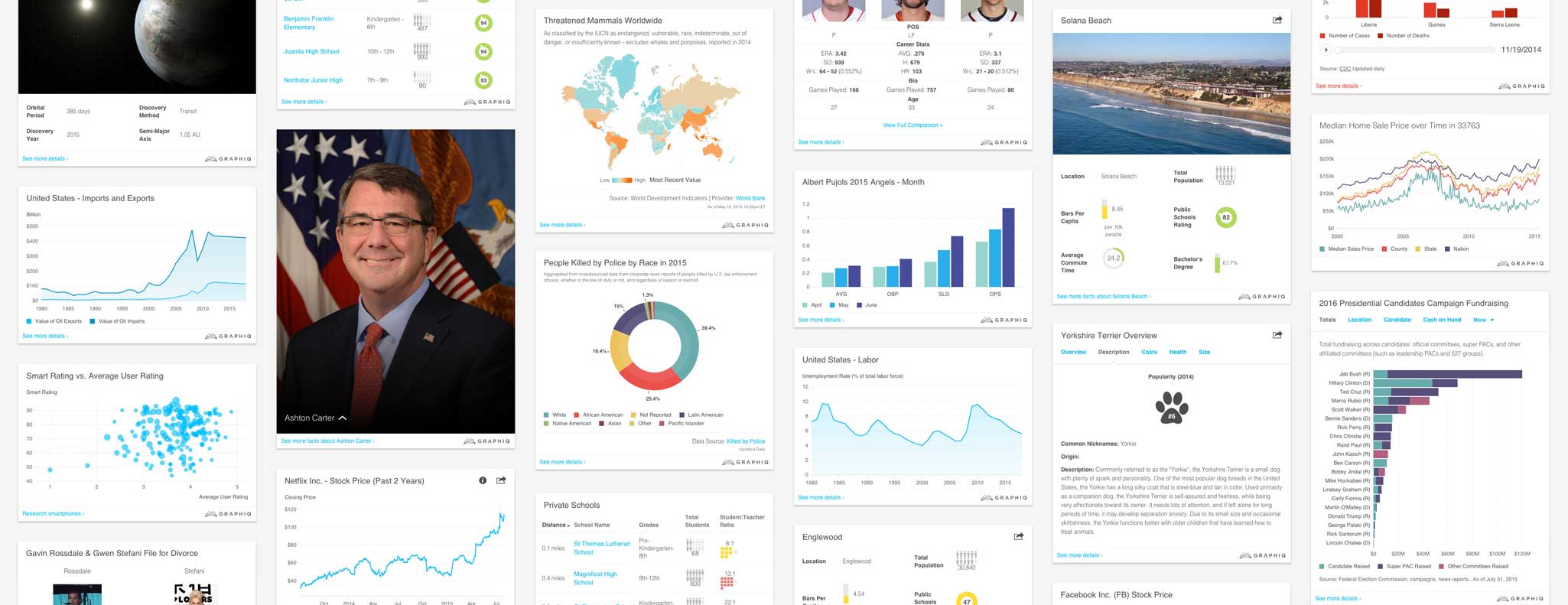
August 2013, David Schnurr and Luke Depass created version one of the embeddable visualizations:
 |
 |
My Role
Late 2014, the company began to focus on visualizations and I started to think about the system that generates them. With the support of the team, I took charge of the design aspect and introduced the card metaphor, a grid system, and a modular component framework over the last two years. I also designed and polished the color palettes, the chart configurations, and other elements of these visualizations.
Card Metaphor
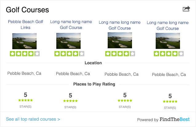
The first task I decided to take on was to find a better metaphor for Graphiq visualizations. The affordance of the “content in a gray border” design language of version one was on the lower end, and I was worried that it might not be sufficient for the potential growth of our visualizations.
I broke down the common components in use across different visualization types:
- Title
- Data Table
- List
- Image
- Chart
- Tabs
- Sections
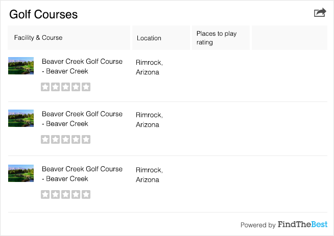
At this level, we didn’t have that many components to design for and thus didn’t need a complicated system to handle multiple layers of information. And that’s why we could just use a border to box our content and let it be.
However considering the nature of flat design, we wanted to help our visualizations stand out more from their surrounding content. Therefore, just taking one step up from the completely flat design, a card-based design would be appropriate for our knowledge units.
 |
It is still very minimalistic and universal, letting the information do the talking and eliminating extra UI elements; yet it distinguishes the visualizations from the content flow. And it also provides a reference to real world objects—intuitively people know a card could be flipped and folded. That leaves more room for features to come.
While we only need one layer of cards as of now, Google’s Material Design showcased how we could grow from one layer of cards to multiple layers of cards if we decide to adopt a more complicated information structure later on.
Minimal yet extendable, the card served us well.
Grid System and Content Blocks
With a defined style and a blank card, I moved on to create a grid system and the building blocks for our visualizations.
At Graphiq, knowledge engineers and content editors are the creators of our visualizations. They can put in any data they want, in any format and layout they want on to our knowledge cards. Such flexibility makes sense for the small startup but resulted in a nesting nightmare for our designers and developers. Having all different kinds of elements—from a data point to a table, to infographics, to charts, to columns—all nested differently, it became very difficult to maintain a consistent visual presentation.
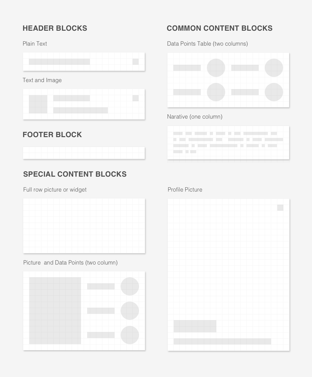
Because there was a lot of legacy code and we didn’t have a ton of resources to pay back the technical debt, I introduced a 20px by 20px grid system to help regulate the visual appearance of each element and designed a handful of content blocks:
 |
Manage Whitespace
Visually, we found a solution. However, on the code level, nesting is a thorny issue to handle still. How can we find a way to maintain consistent white space in between web elements no matter how they are structured or nested?
This issue haunted me for weeks until I drew inspiration from Lego, and decided to put a consistent padding around each element and took away all the padding and margin on structural elements.
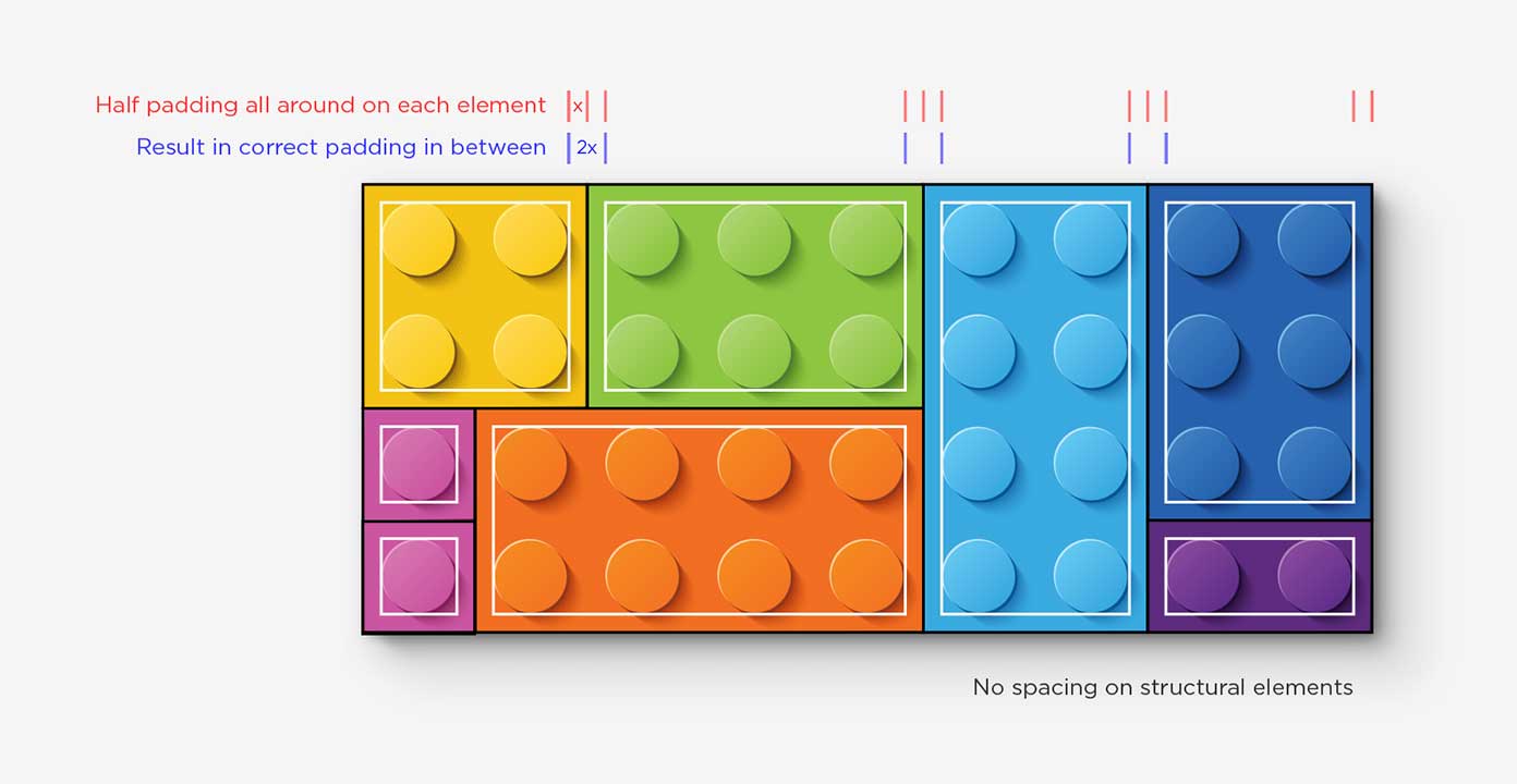
You can read more about this method in my recent article on A List Apart: Learning from Lego: A Step Forward in Modular Web Design.
With this method of managing white space, we could now allow columns, nested in rows, nested in columns, while still maintain a modular presentation without adding on layers of style overrides.
Polish Every Element
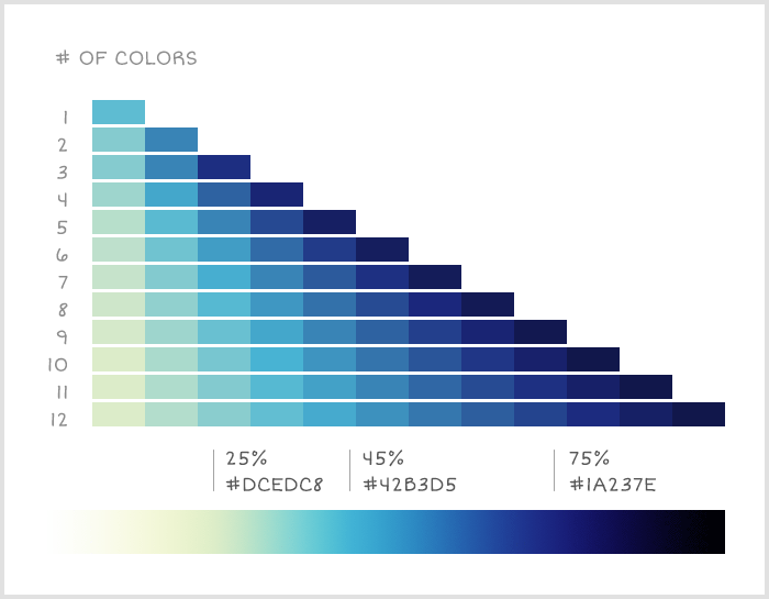
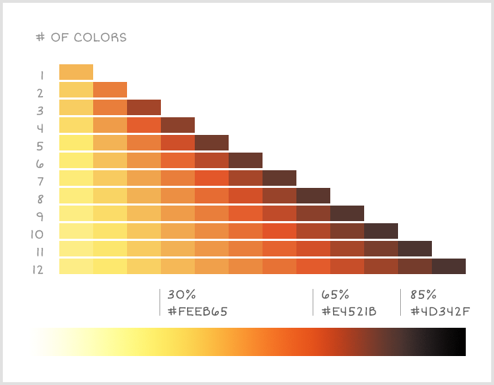
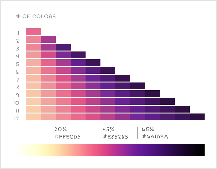
After defining the metaphor and the design system of our visualization, I moved on to posh individual elements. I did a study of visualization color palettes and a round of clean up for all the small details.
You can read about my findings around color palettes on the Graphiq Blog.
 |
 |
 |
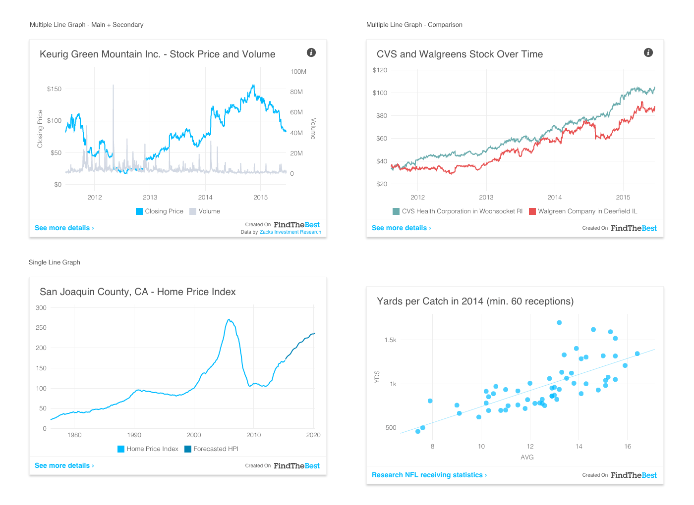
A few screenshots to show some of the small fixes I made to the charts over time:
 |
It was a continuous effort to tweak, test, and polish every single element of our visualizations, until we got acquired by Amazon and shifted our focus to design visualizations for multimodal Alexa-enabled devices like Echo Show and Echo Spot.
Read More
Other articles I wrote about Graphiq visualizations and my thinking process behind:
- Visualizing the World’s Knowledge
- Finding the Right Color Palettes for Data Visualizations
- Finding the Best Free Fonts for Numbers
I hope you find this article useful. If you want to get an email every time I write something new, subscribe to the list below.