Finding the Right Color Palettes for Data Visualizations
 |
While good color palettes are easy to come by these days, finding the right color palette for data visualizations is still quite challenging.
At Graphiq, things are arguably made even more difficult, as we need to convey information across thousands of unique data sets in many different types of visualization layouts.
Current Problems
Rather than diving in head first and creating our own color palette, we started by conducting some research on existing color palettes around the web. Surprisingly, we found that few are actually designed for complex charts and data visualizations. We identified several reasons as to why we couldn’t use existing color palettes:
Problem 1: Low Accessibility
Many of the color palettes we looked at were not designed for visualizations. Not only do they not vary enough in brightness, but they were often not created with accessibility in mind. Flat UI Colors is one of the most widely used color palettes out there, and it’s easy to see why: it looks great. But, as its name indicates, it’s designed for user interfaces. Those who are color blind may find it difficult to interpret a data visualization that uses the Flat UI palette:
 |
 |
 |
Flat UI Colors in full colors, protanopia mode, and grayscale.
Problem 2: Not Enough Colors
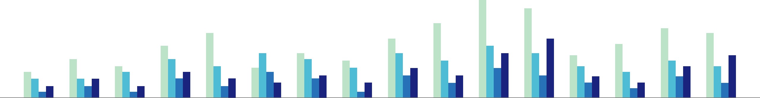
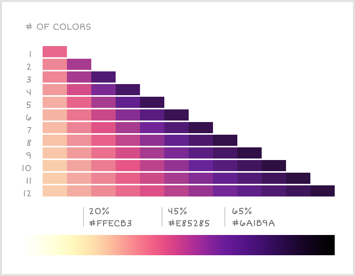
Another problem is that many existing color palates did not have enough colors. When building Graphiq visualizations, we need a palette that offers at least six colors, if not eight to twelve colors, to cover all of our use cases. Most color palettes we looked at did not provide enough options.
Here are a few examples from Color Hunt:
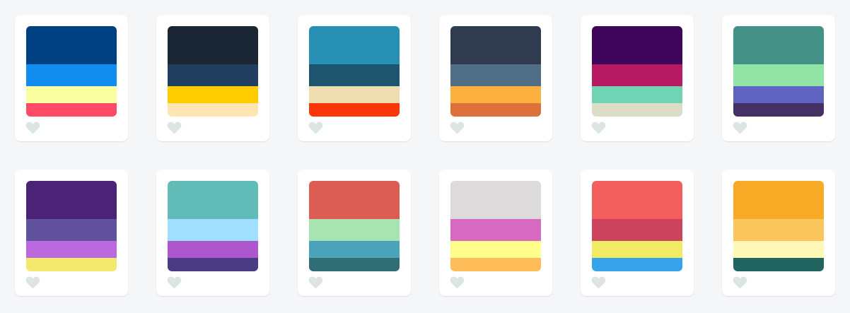
While they are good color palettes, they are not flexible enough to present complex data series.
Problem 3: Hard to Distinguish
But wait a second, there are color palettes that are like gradients — theoretically one can create any number of colors from that, right?
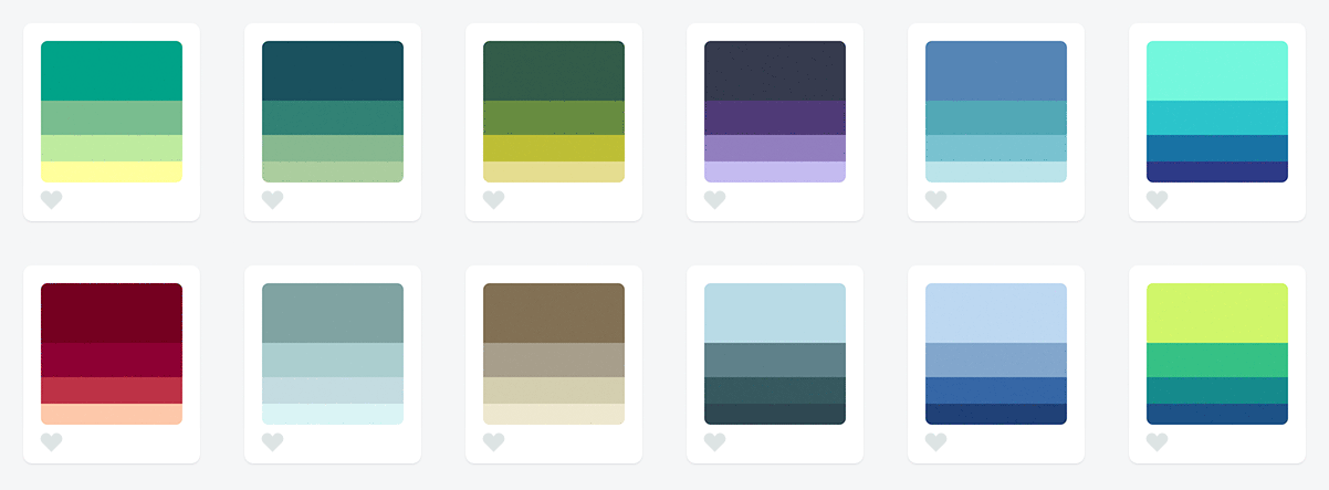
Unfortunately, there’s often not enough variation in brightness, and many of them would become indistinguishable very quickly, like these ones, also from Color Hunt:
Let’s just try taking the first one and extending it to a ten data series:
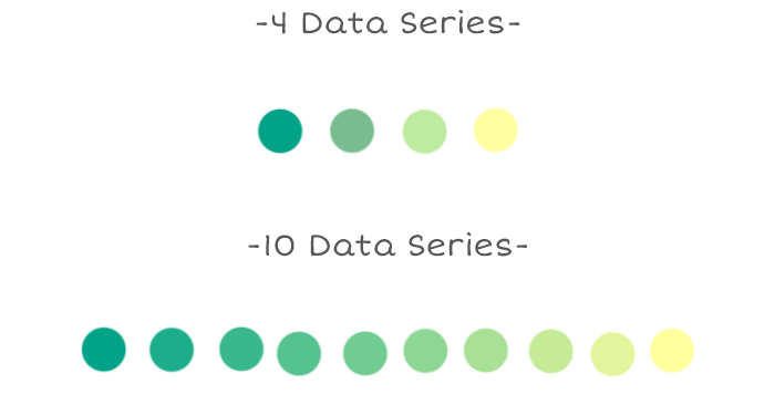
I’d be surprised if the average user could correctly distinguish the colors in the visualization and match up to the label in the legend, especially among the four greens on the left hand side.
Our Approach
At Graphiq, we think, eat and breathe data, and we invested a lot of time in finding not one, but multiple color palettes that worked for our visualizations. We learned a lot during this process, and we wanted to share three rules we’ve discovered for generating flexible color palettes:
Rule 1: Have a wide range in both hue and brightness
To make sure color palettes are extremely accessible and easy to distinguish, they must vary enough in brightness. Differences in brightness are universal. Take any monochromatic color palette and test how it looks in Protanopia, Deuteranopia, and grayscale mode. You’ll quickly be able to tell how accessible this palette is.
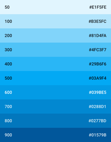 |
 |
 |
Light Blue from Google Material colors in full colors, protanopia mode, and grayscale.
However, having a palette that varies only in brightness may not be enough. The more variance you can have in the color palette, the easier it is for users to map your data series to the visualization. If we can utilize the change in hue for people who are not color blind, it will delight them even more.
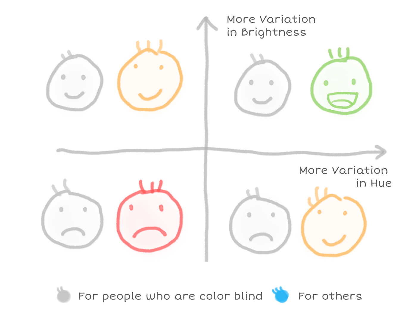
And for both the brightness and the hue, the wider range you can find, the more data series you can support.
Rule 2: Follow natural patterns of color**
There’s a secret that designers know which is not always immediately intuitive to left-brained folks: Not all colors are created equal.
From a purely mathematical standpoint, a color progression that transitions from light purple to dark yellow should feel roughly similar to a transition from light yellow to dark purple. But as we can see below–the former feels natural, and the latter not so much.
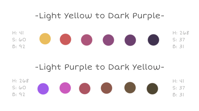
This is because we’ve been conditioned by gradients that consistently appear in nature. We see bright yellow transition into dark purple in gorgeous sunsets, but there’s really no place on earth where you can see a light purple transition into a dark brownish yellow.
Photos from Kyle Pearce, Wesley Fryer, and Jon Sullivan.
Similarly, a light green to a purplish blue, a light dry yellow to dark green, an orangey brown to cold gray, and more.
Photos from Kbh3rd, Ian Britton, and Jon Sullivan.
Because we see these natural gradients all the time, they feel familiar and pleasant when we see a corresponding palette used in a visualization.
Rule 3: Use a gradient instead of choosing a static set of colors
Gradient palettes that incorporate different hues offer the best of both worlds. Whether you need 2 colors or 10 colors, colors can be strategically extracted from these gradients to produce a visualization that feels natural, but also has enough variation in hue and brightness.
It’s not easy to switch to a gradient mindset, but a good way to start is by setting up grid lines at the breakpoints for each number of data series in Photoshop and constantly testing the gradient and making tweaks. Here’s a snapshot of the process we used to perfect our gradients:
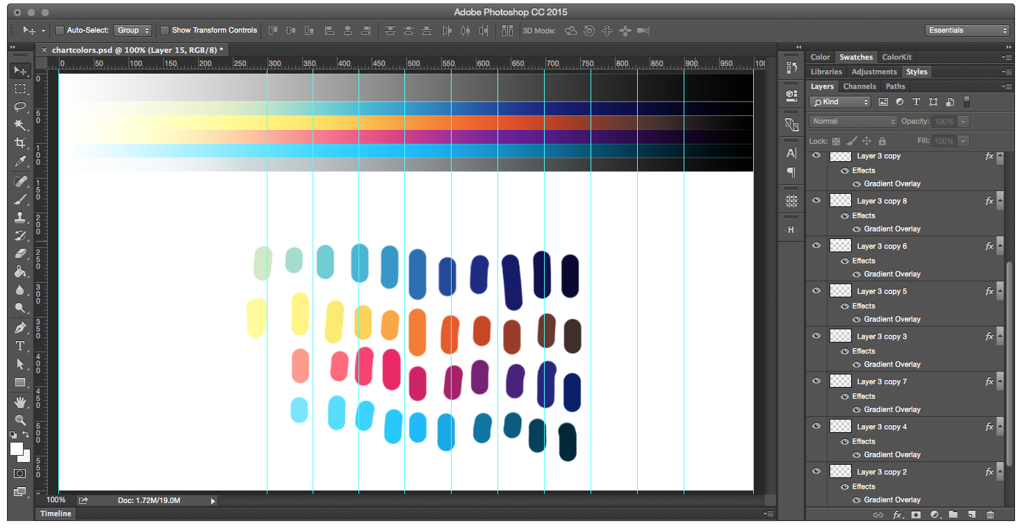 |
As you can see, we place our color palettes at the top against grayscale, tweak the gradient overlays (so we can get the exact transition code later), and select colors from those breakpoints to test how the palette would work in real life.
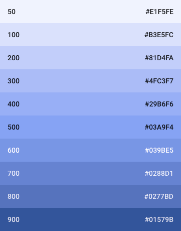
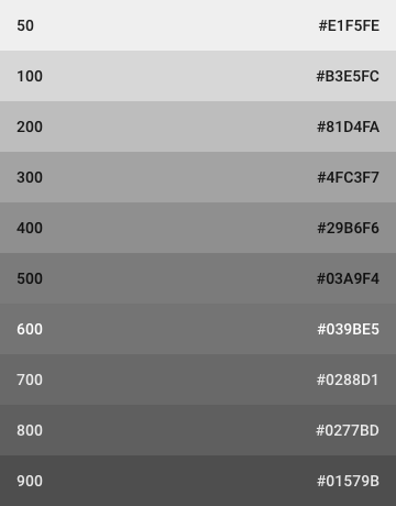
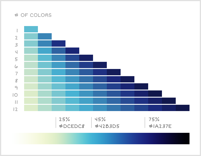
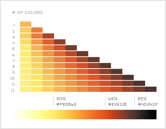
Our Palettes
We’re excited about what we ended up with. Here are some of our color palettes in use, they all begin with pure white and end with pure black to achieve the maximum variation in brightness.
 |
 |
 |
TL;DR
While there are an increasing number of good color palettes out there, not all of them are applicable to charts and data visualizations. Our approach to visualization color palettes is to make natural gradients that vary in both hue and brightness. By doing this, our palettes are accessible by people who are color blind, obvious for others, and works with anywhere from one to twelve data series.
Readings, Tools & Resources
Along the way, we identified a few great resources and articles that reached similar conclusions as we did, but take a more mathematical approach and even dive into the color theories. We thought we’d share for further reading:
Readings
-
Mastering multi-hued color scales with chroma.js by Gregor Aisch
-
The viridis color palettes by Bob Rudis, Noam Ross and Simon Garnier
Tools
-
Color Picker for Data — a handy color tool where you can hold chroma constant and pick your palette with ease
-
Chroma.js — a JavaScript library for dealing with colors
-
Colorbrewer2 — a great tool for finding heat map and data visualization colors, with multi-hue and single-hue palettes built in.
-
gradStop.js — a JavaScript library to generate monotone color schemes and equidistant gradient stops
-
Color Oracle — a free color blindness simulator for Window, Mac and Linux.
-
ColorBox — a new tool by Lyft Design that let you control the easing curve of hue, saturation, and luminosity individually.
Other Resources
And here are some other good color palette resources we found and loved. While they are not necessarily designed for data visualization, we think you would find them useful.
-
ColorHunt — high quality color palettes with quick preview feature, great resource if you only need four colors
-
COLOURlovers — great color community with various tools to create color palettes as well as pattern designs
-
ColorSchemer Studio — powerful desktop color pick app
-
Coolors — light weight random color palette generator where you can lock the colors you want and swap out the others
-
Flat UI Colors — great UI color set, one of the most popular ones
-
Material Design Colors — another great UI palette. Not only does it provide a wide range of colors, it also provides different “weights” or brightness of each color
-
Palettab — a Chrome extension that shows you a new color palette and font inspiration with every tab
-
Colors from Canva’s Design Wiki — a wiki-style color library with detailed information about colors and their combos.
I hope you find this article useful. If you want to get an email every time I write something new, subscribe to the list below.