Visualizing the World’s Knowledge
How we designed visualizations to deliver our complex and extensive datasets.
A Unique Challenge
At Graphiq, we’re working to deliver the world’s knowledge. It’s our belief that everyone benefits from knowledge, but in today’s world, it’s not always easy to access. Our goal is to deliver knowledge in accessible, engaging ways so that populations can both understand and use data to make better, more informed decisions.
Over the last six years, we have collected 128 billion data points describing 922 million entities across 800 topics — from dog breeds and smartphones and companies. We’ve also organized our data into millions of digestible knowledge units, which left us with a challenge: How do we design a medium that is meaningful, but also capable of incorporating our massive and complex datasets?
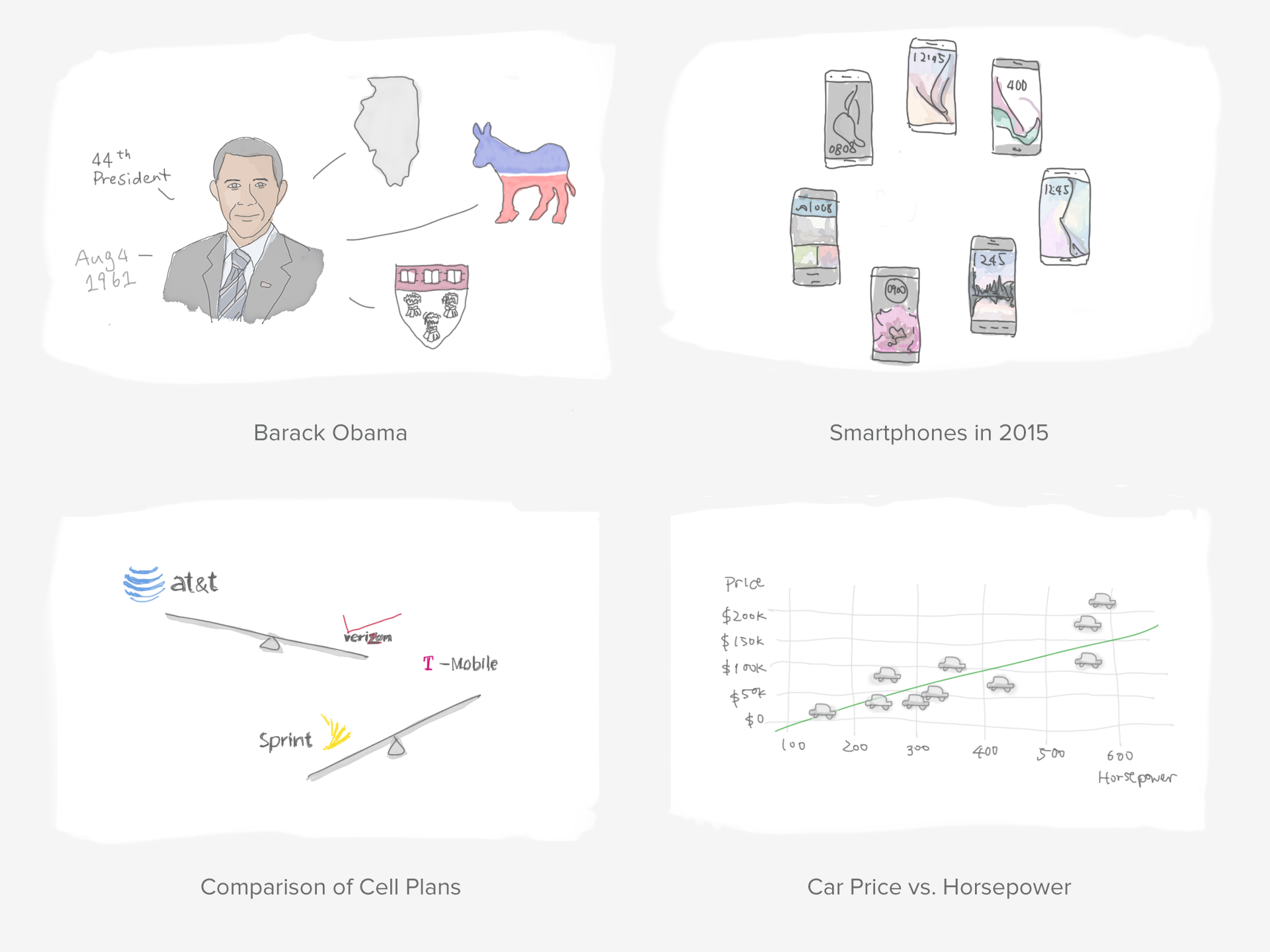 |
The sketch above gives some examples of knowledge units we might want to visualize — key facts about Barack Obama, a list of smartphones released in 2015, a side-by-side comparison of major cell plan providers, correlations between a cars’ price and horsepower.
We typically need to work with information across hundreds of topics, images of different sizes and ratios, attribute names of different lengths, and data of different formats and magnitudes.
As designers, we know that it’s far easier to design for a specific dataset, or at least a defined topic. But in this case we can’t tailor-make millions of visualizations one by one — we need logic and a design system to generate visualizations en masse. The closest design system we can refer to are Google’s knowledge cards, but even those cards don’t vary as much as our own visualizations — they don’t offer comparisons, and they rarely, if ever, show charts.
We needed a design system that accommodates all visualization types we have now, and could possibly have in the future.
Our team was incredibly fascinated by this problem, and we wanted to share our approach to tackling difficult design challenges like this.
Break It Down
When we have a complex design problem at hand — in this case, designing a system for millions of knowledge units — it’s always helpful to break it down to tangible parts.
To kick off the project, we started to sort through all the visualization types and variations we currently had in our platform. At the highest level, we have 6 different types of visualizations that are meaningful and helpful for our audience in different contexts:
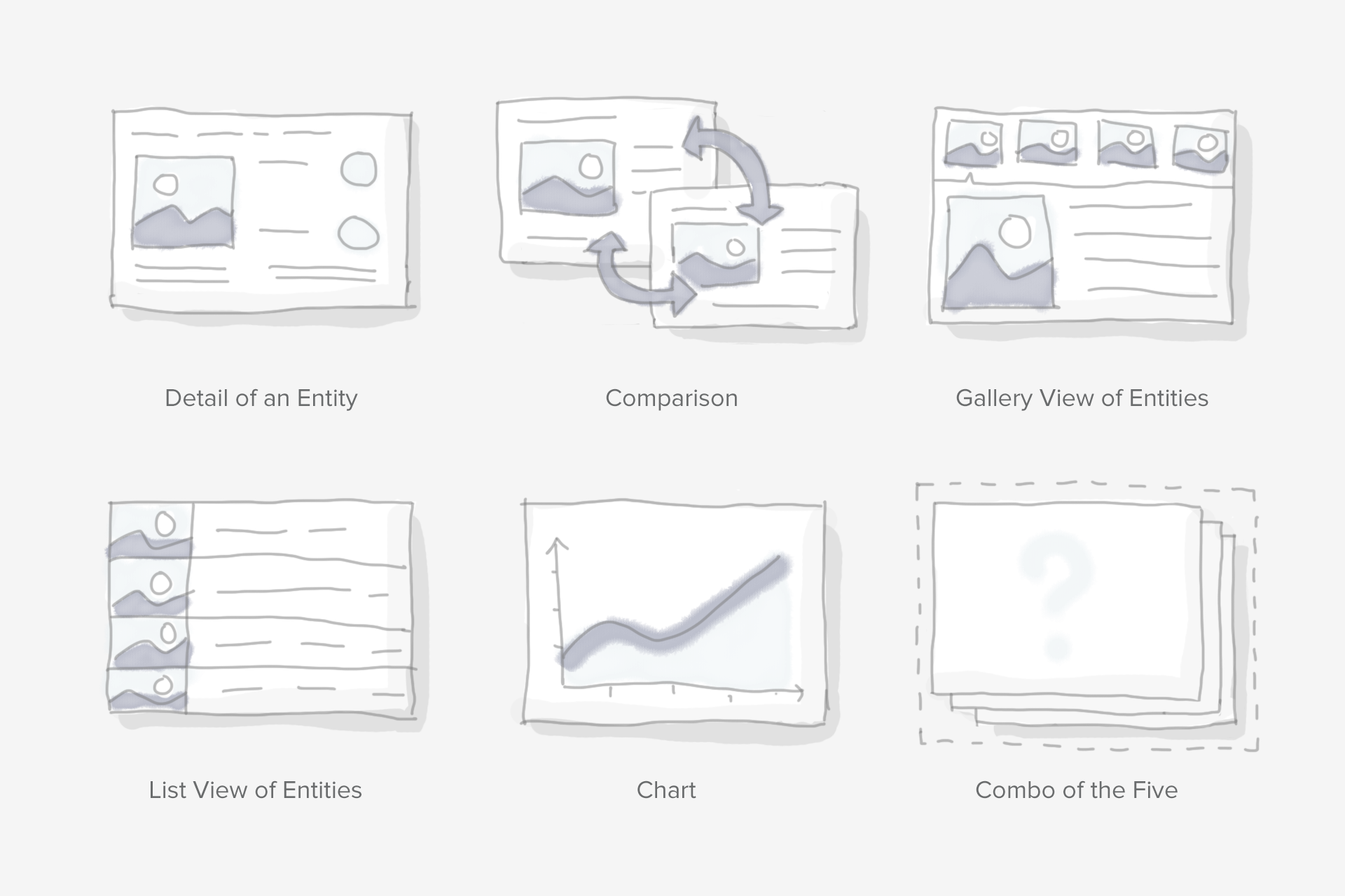
While this does simplify things, these six types still look pretty different in nature (especially if you take into consideration the wide range of topics we cover). So we further break it down into different components that can be used within these visualization types:
- Title
- Data Table
- List
- Image
- Chart
- Tabs
- Sections
At this level, we’ve found that we don’t actually have that many components to design for. Of course, we still have to handle the extreme cases for each of these components — short titles or abnormally long titles, tables with one data point or 100 data points, a low-quality photo or a vector image. But even so, breaking things down made the solution seem much more manageable, and this list served as a guide when we made our design system later on.
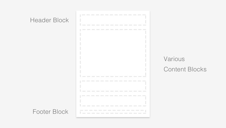
Flat on a White Card
At Graphiq, we generally take a minimalistic approach to both design and development. We care about the simplicity of our codebase, and we strive for solutions that are wildly scalable. Looking at the list of components, it’s clear that we don’t need a complicated system to handle multiple layers of information. While the content itself can drastically vary, the information architecture itself is rather simple.
For maximum adaptability, we eschewed borders wherever possible, and because these units are vessels for delivering knowledge, we really wanted to let the information do the talking and eliminate any extra UI. What we ended up with was a modern, flat design.
Considering the nature of flat design, we wanted to avoid completely blending in with surrounding content–it was important that our visualizations stand out. That said, having a colored background was not an option because it needs to be compatible with all the content we might ever display. Therefore, we decided to implement the card metaphor to help it pop out from the content flow:

Grid System and Building Blocks
With a defined style and a blank card, we moved on to creating a grid system and the building blocks for the content. This isn’t too different from building something with Legos: we need a grid system to make sure all the blocks are compatible with each other, and then we need a small list of building blocks that can be repurposed. From those, we can create infinite combinations to suit our needs and convey massive amounts of information.
Here’s an example of the first batch of blocks we supported:
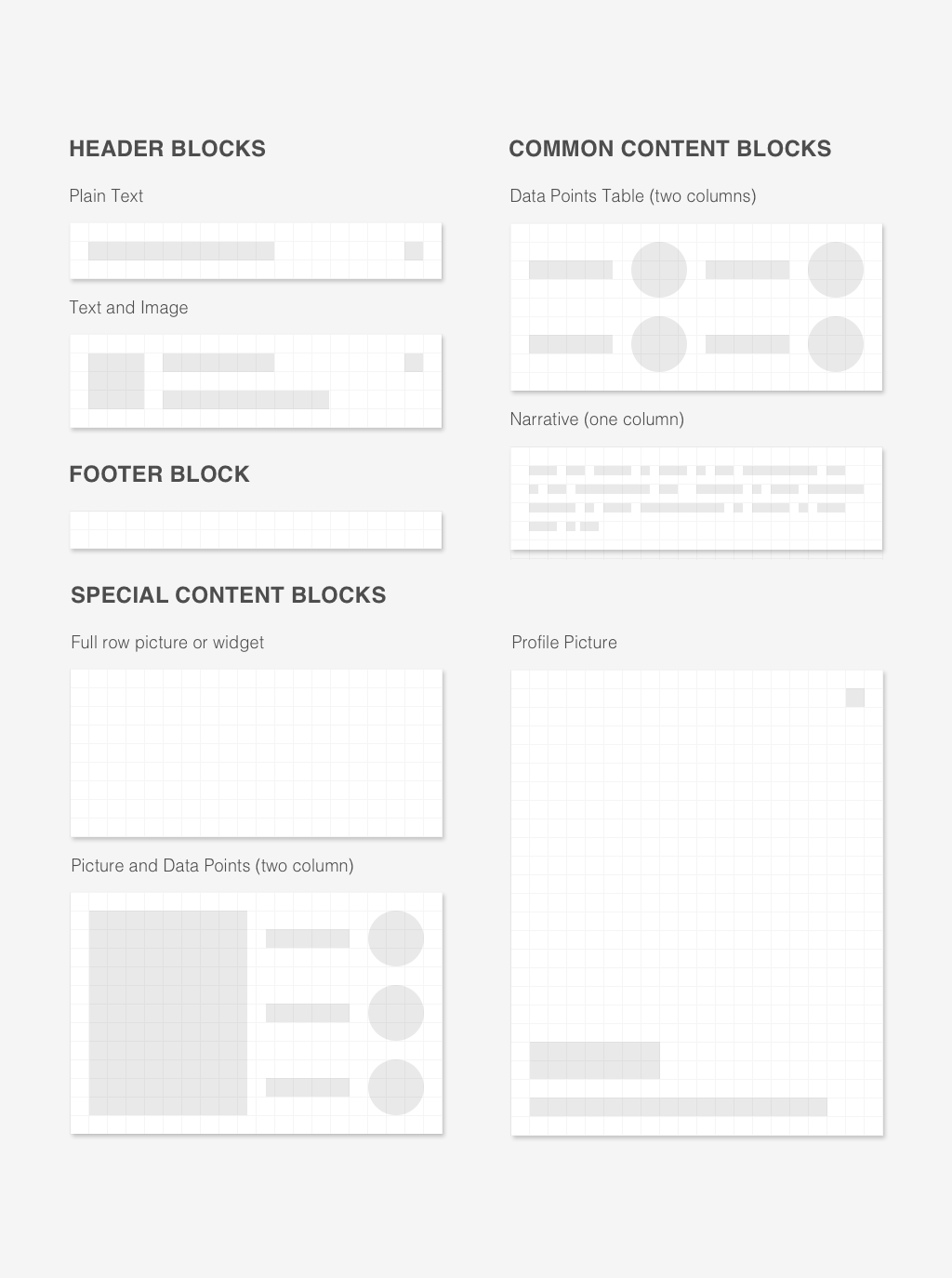
With just those building blocks, we can create a ton of different visualizations.
Here’s a quick GIF showing how we assemble those blocks into a visualization about Walmart Stores, Inc.

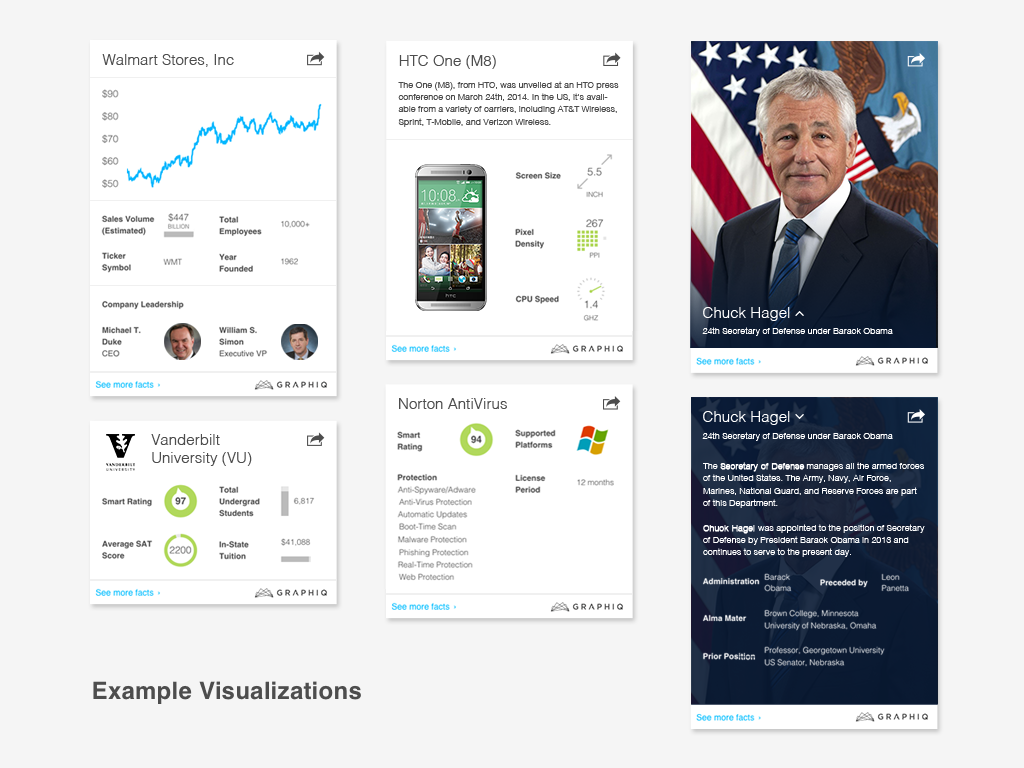
More examples we created with our first batch of blocks earlier this year.
 |
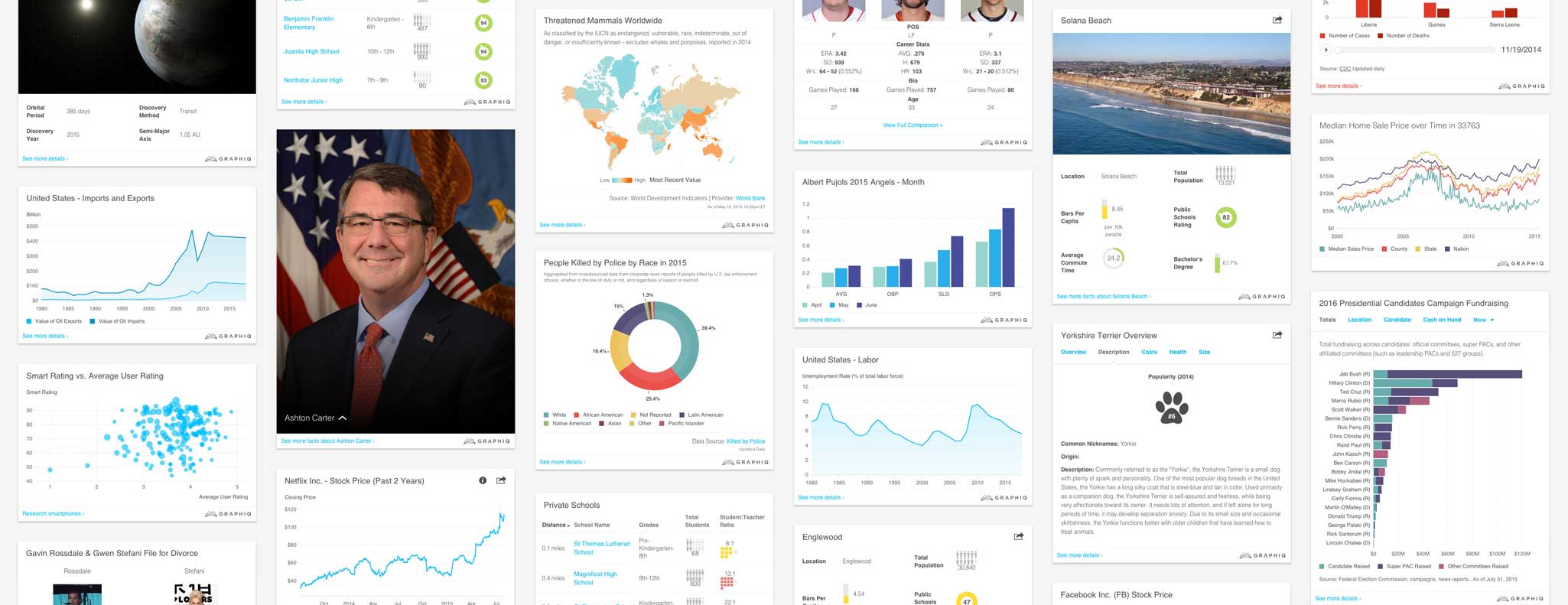
Scale
As the list of blocks kept growing, the number of possible combinations grew exponentially. We now have more than 20 different blocks that we’re using to create thousands of new Graphiq visualizations each day.
This is only the beginning of our journey in designing and delivering the world’s knowledge. We’ll continue to share our approach with the designer and developer community — how we designed for various types of charts, how we find color palettes that work across different topics and work for color blind users, and much more.
I hope you find this article useful. If you want to get an email every time I write something new, subscribe to the list below.