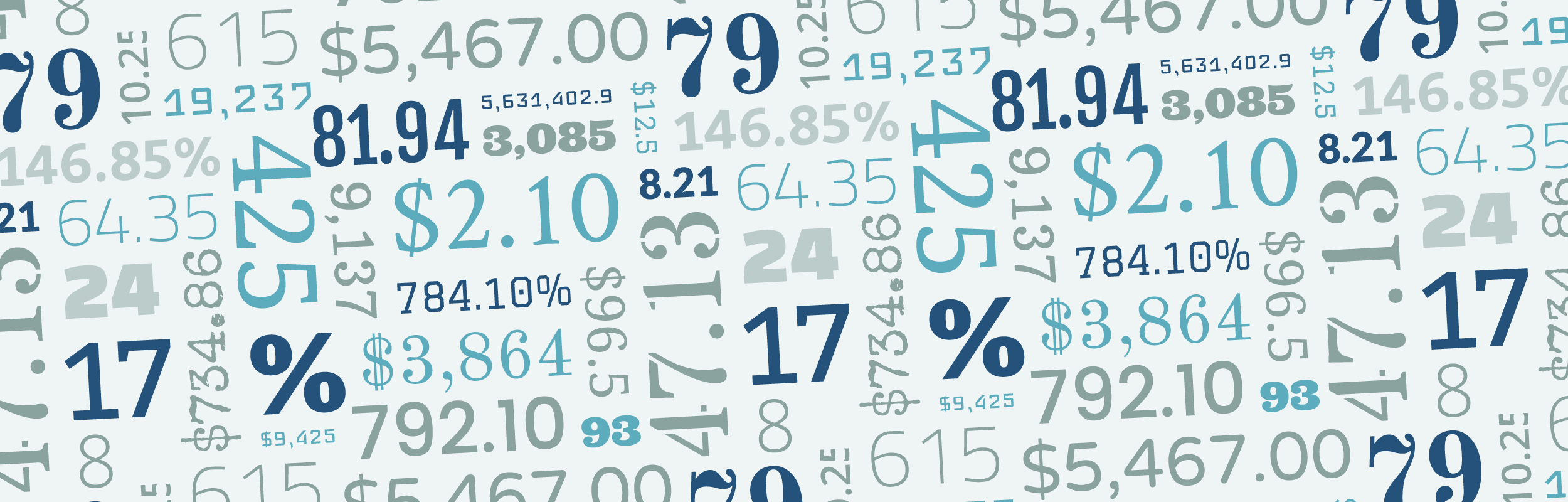
Finding the Best Free Fonts for Numbers
Including a Recommendation List for 20 Google Fonts
 |
Though there are countless blog posts and recommendation lists for fonts and font pairings these days, when you look for best fonts for numbers, it’s not as easy to find. If you can’t afford FF DIN or Numbers by H&CO, there isn’t much guidance, let alone a go-to recommendation list.
Our Principles
At Graphiq, we think about data tables, charts, and infographics all day every day. Though we use Helvetica for most of our embeddable data visualizations, we do have several guidelines for picking number fonts and we are happy to share them with the world.
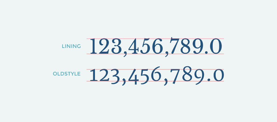
1. Lining and Tabular
The first rule for picking a good number font is to make sure it comes with lining and tabular figures.
Fancy typography terms aside, lining just means that all the numbers are sitting on the baseline and aligned with the cap height, instead of going up and down (which is called “oldstyle”).
 Top: Libre Baskerville; Bottom: Merriweather
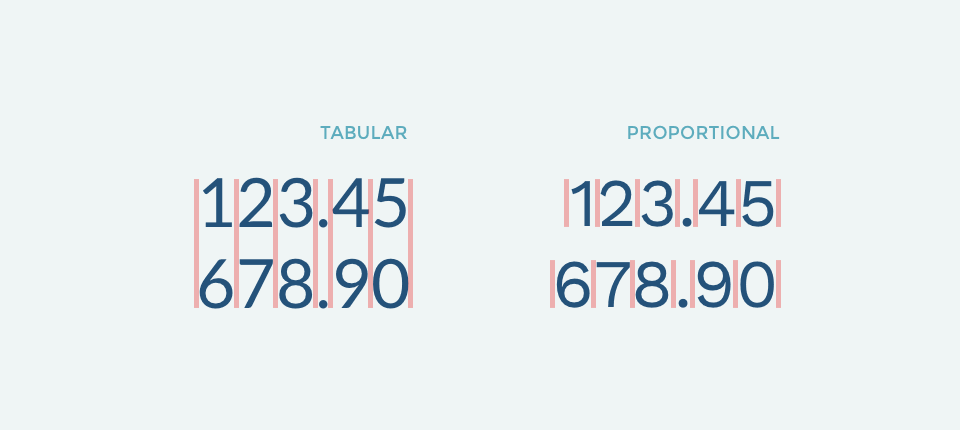
Tabular just means the numbers are monospaced — every number occupies the same horizontal space, instead of varying space according to their own shape (which is called “proportional” in typography terms).
 Left: Lato; Right: Work Sans
Tabular figures offer better vertical alignment than proportional ones. Though it’s not necessary for all use cases, it’s nice to use tabular numbers as a default.
2. Good Number Symbols
The second step is to check that any given number font has good number symbols. With free fonts, it’s sometimes unpredictable how good those symbols are.
Some examples of “$” and “%” symbols that might surprise you if you don’t check ahead:
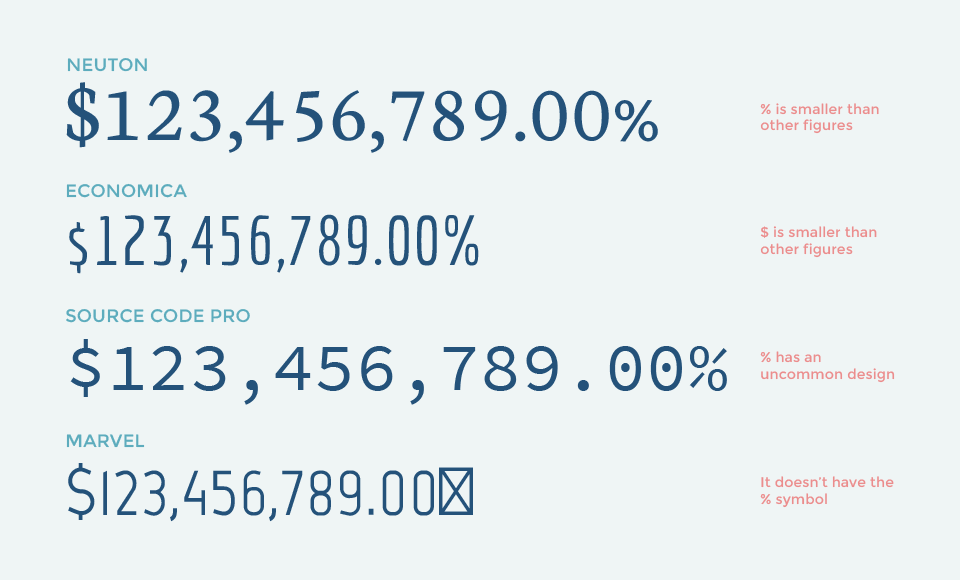
We always make sure to check “%” and “$,” so we use “$123,456,789.00%” as the testing string. If your data set requires other symbols, it’s a good idea to include them as well.
3. Check Each Individual Figure Design
Lastly, before settling on a font, it’s good to double check on all its individual figure design — make sure the number one doesn’t look like seven, five doesn’t look like six, etc.
Similarly, here are some examples of confusing and weirdly designed figures:
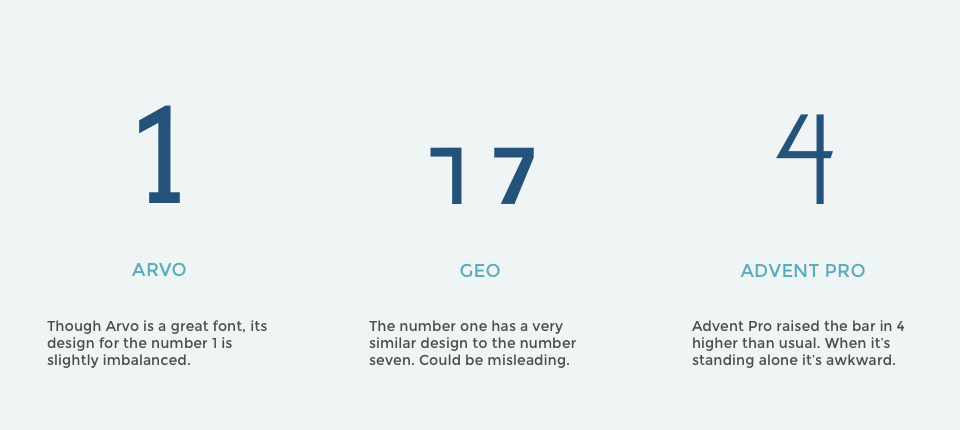
Those are special cases, and those fonts are probably not made to be number fonts, but they are good examples to emphasize the importance of checking each individual digit.
Google Font Recommendations
With these three principles in mind, we went through the entire Google Font library and picked the five best number fonts in each category.
Serif Fonts
We start the recommendations with serif fonts. There are a number of different styles of serif fonts in general, and we tried to pick the best from each style.
1. Droid Serif
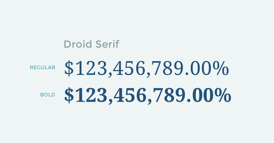
Droid serif is a no-brainer. A typical, good, contemporary serif font with well designed numbers. It doesn’t add too much flare to your project, but it’s universal and it’s extremely easy to read on any screen.
If you happened to use PT Sans or Source Sans Pro, PT Serif and Source Serif Pro are two other generic serif fonts with good number design.
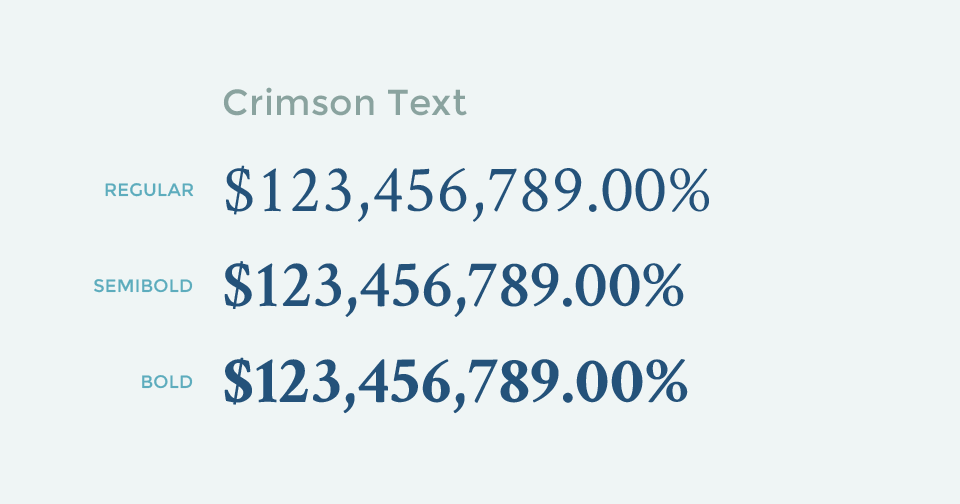
2. Crimson Text
 Semibold and bold are slightly shrunk in font size here, otherwise they would be too long.
Next, for the Garamond-style serif fonts, Crimson Text is the way to go. It’s a wildly used serif font and it ships with lining and tabular figures. The numbers are well designed and fit nicely into that style.
3. Old Standard TT
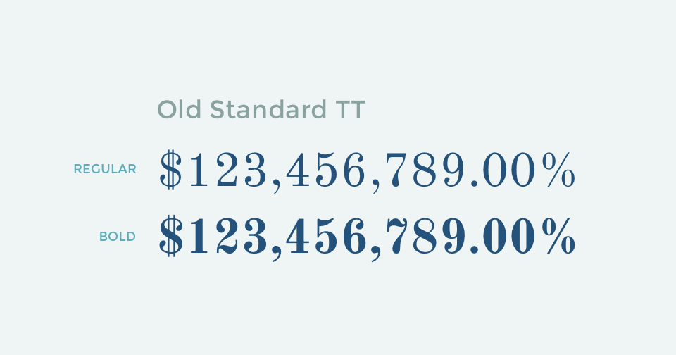
If you are looking for a classic, elegant style, Old Standard TT is your font. With the double vertical line of the dollar sign and the beautiful squiggle of the bolded “2” and “7”, it surely brings out that old school feeling.
4. Kameron
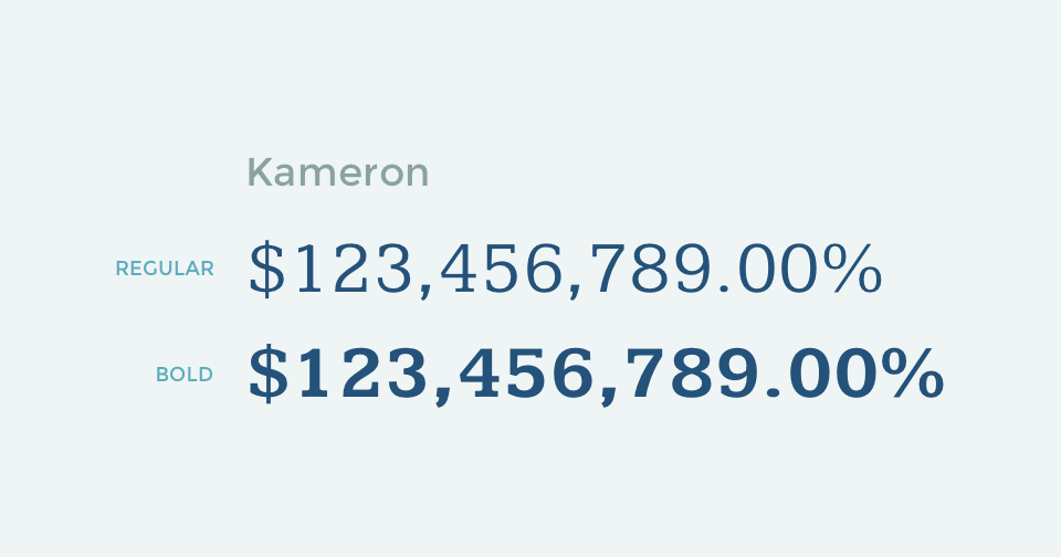
Kameron might not be as well-known as the fonts listed before, but it has nice slab serif numbers and it has wider figures than most serif fonts. A good number font to keep in the toolbox for sure.
5. Copse
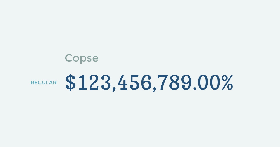
Then, there’s Copse. Again, a less well-known serif font with some unique features. The low-contrast design give it a sturdy posture. It has that classical feeling but is also very readable even in small font sizes.
San Serif Fonts
Moving onto san serif fonts, there are many great system UI fonts with good figures in this category. We featured the best two here, with three other fonts in their distinctive styles.
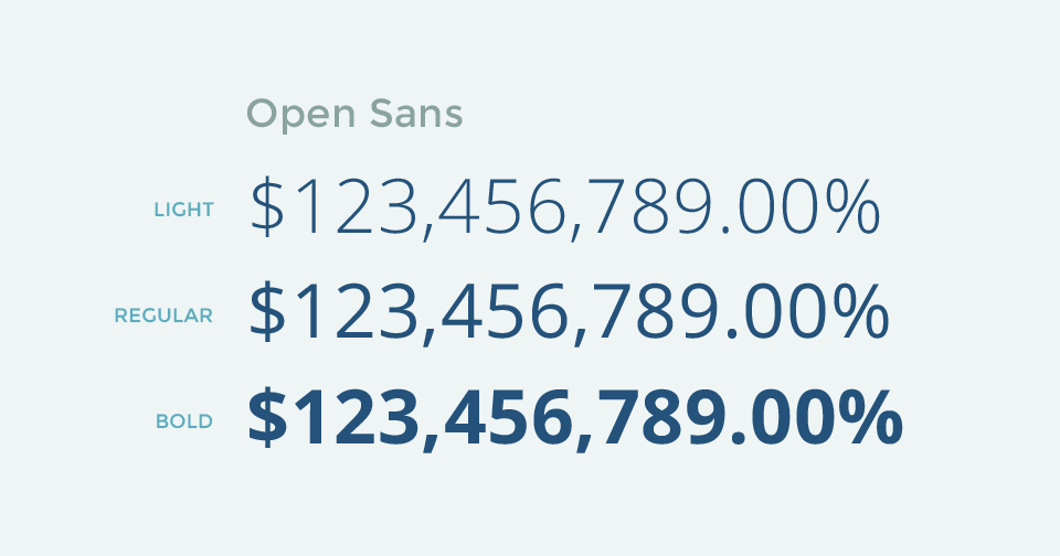
1. Open Sans
 It has more font weight variations than the three shown here.
Being the most popular Google font, Open Sans is all over the internet these days. Many may argue it’s boring and will become a cliché like Helvetica, but it’s a good universal san serif font with nice figures. If you’re using Open Sans already, use the numbers.
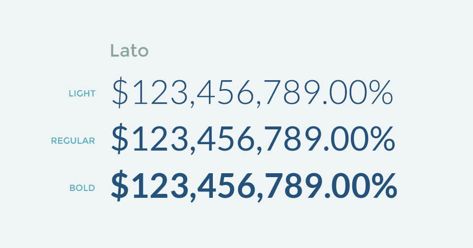
2. Lato
 It has more font weight variations than the three shown here.
Another widely-adopted san serif font, Lato provides a very different style from Open Sans, with lower contrast and the slab of the number “1,” but still very transparent and works in all cases.
3. Roboto Condensed
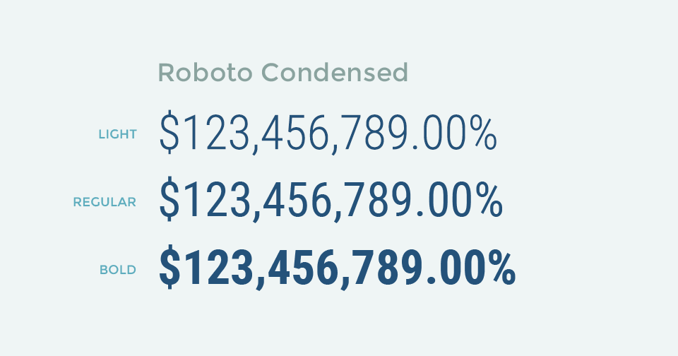 It has more font weight variations than the three shown here.
When thinking about san serif number fonts, some of you might want to use Oswald for that strong, condensed style. Sadly, Oswald comes with proportional numbers, and won’t work when you need vertical alignments. Roboto Condensed is the best tabular alternative we found.
4. Titillium Web
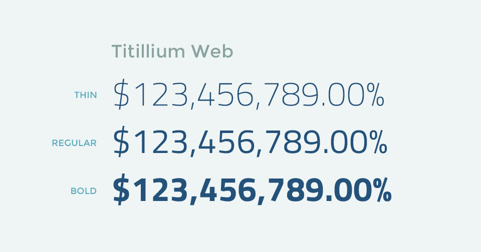 It has more font weight variations than the three shown here.
Titillium Web has a very unique style. It’s squarish and has a rigors feeling. If you want a style to deliver cold hard truth, Titillium might be a good pick.
5. Varela Round
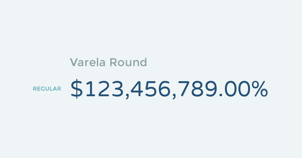
Varela Round is the exact opposite. It’s very round and cute. If you want to make your numbers more friendly, or it fits your industry, Varela Round is a nice choice.
Also, it’s worth mentioning that Varela Round is often used as a lighter version of Montserrat, the very popular san serif title font. Since Montserrat doesn’t have tabular numbers, Varela Round (or Varela) could make a good pairing tabular number font.
Display Fonts
While those generic serif and san serif fonts come in handy when you are making a data table or dashboard, sometimes you also need fonts with a strong presence and personality when you are making an infographic and posters with huge numbers on it. Hence, here comes the display fonts recommendation list.
1. Graduate
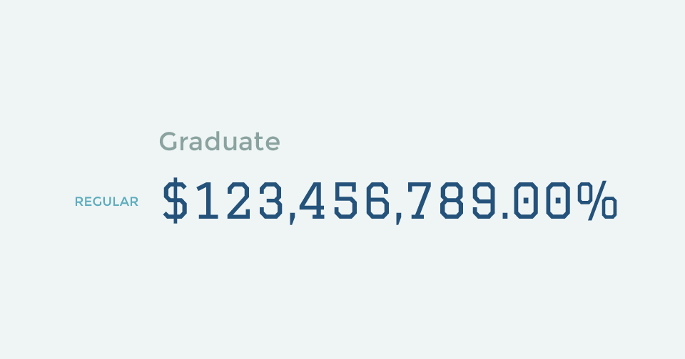
Graduate features some handsome college block style numbers. It’s ideal for a education-related infographic, college football data, and just any strong rigorous number display in general.
2. Changa One
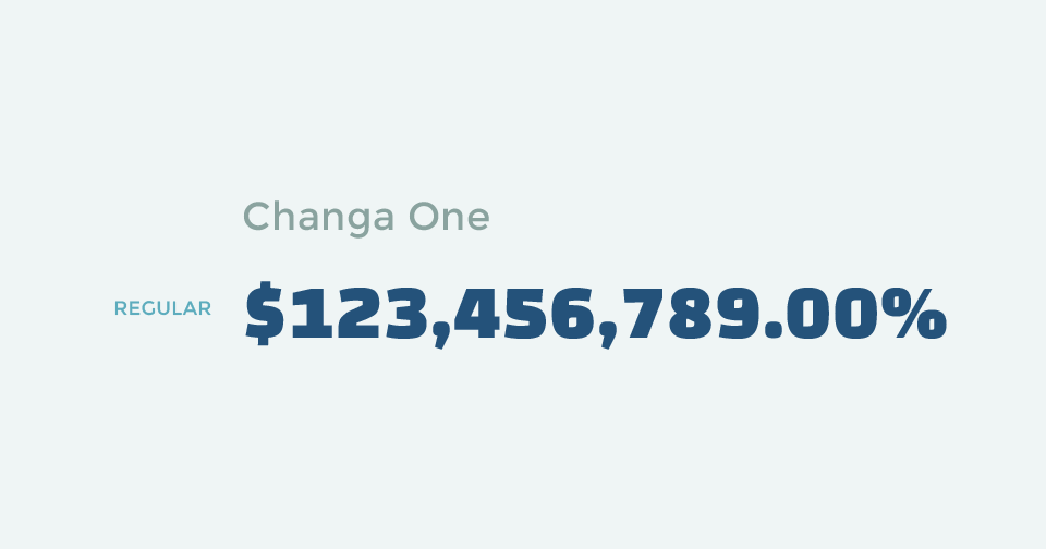
Changa One gives you strong bolded tabular numbers. It’s less formal than bolded san serif fonts, and can come in handy when designing entertainment infographics and posters.
3. Special Elite
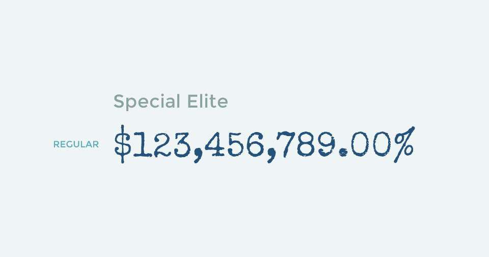
You might not believe it, but this hand-written-style font actually comes with tabular numbers. Special Elite is perfect for nostalgic designs or even listing out something more cryptic, like the number of committed murders for a given criminal. It’s a very unique font that can be utilized in a number of ways.
4. Stardos Stencil
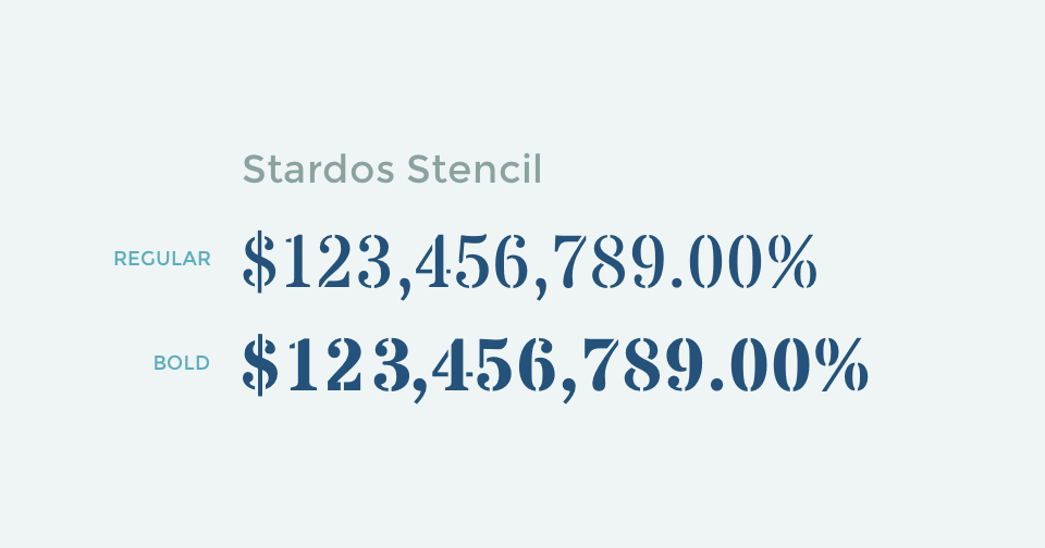
Stardos Stencil is a nice font for anything that you’d described as being hipster and designs on brown paper, featuring beautiful serif numbers.
5. Iceland
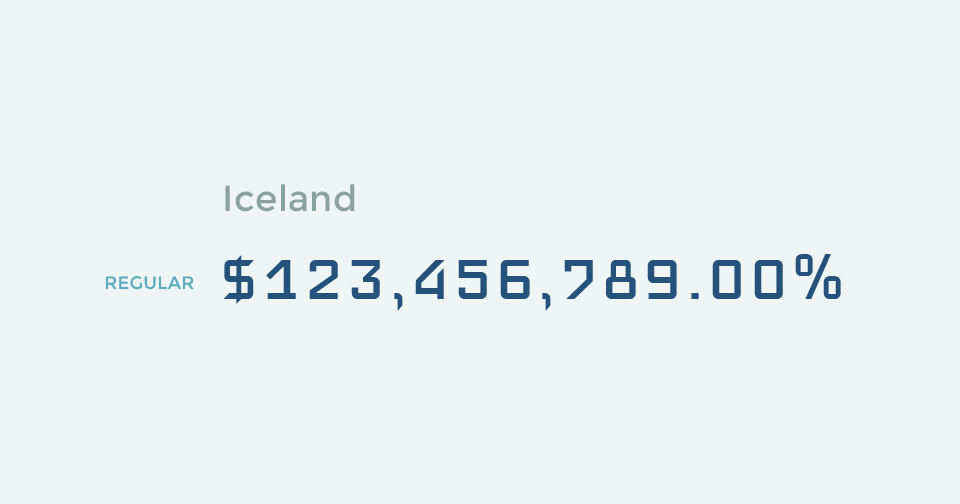
Iceland is a square-based modern geometric font, great for technology and mechanical data. If you want a slightly taller alternative, Iceberg is another good choice from the same designer.
Proportional Fonts
Lastly, there are some great fonts with beautifully designed numbers. The only issue with these is they are not tabular. If you are not overly concerned with vertical number alignment, they could be great choices as well.
1. Montserrat
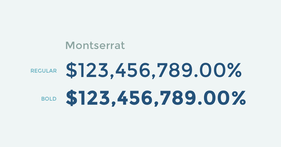
We can’t have a Google font recommendation list without Montserrat. It comes with elegantly designed numbers. (If only they were tabular!)
2. Poppins
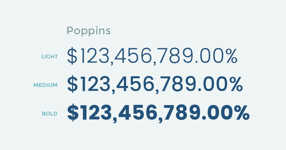 It has more font weight variations than the three shown here.
Another great widely-used san serif, Poppins also has great figure design. The number “9” is slightly awkward, but it’s a great font in general and it has more weight variations than Montserrat.
3. Bitter
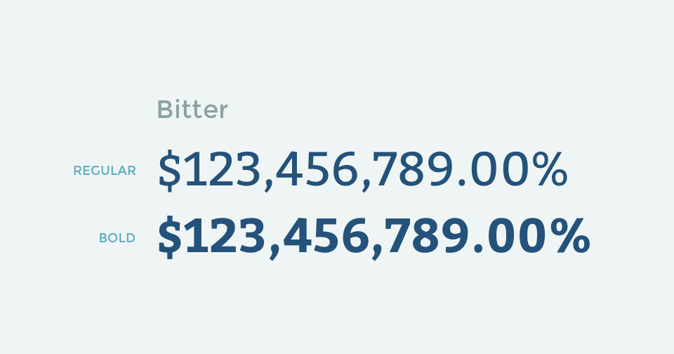
In the world of serif fonts, there is Bitter. A great title font with great numbers. Like Montserrat and Poppins, Bitter is widely used around the world, and you should definitely consider using its numbers if you are using it as the title font.
4. Ultra
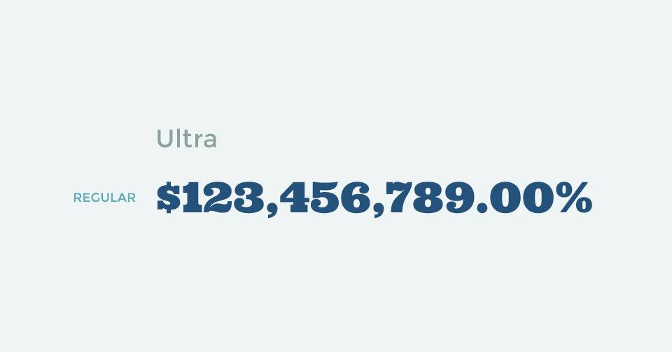
Ultra is the bolded number font you want. If it featured tabular figures, Changa One might not stand a chance. If you’re looking for a font to use for huge numbers like the title of a poster, Ultra is a great pick.
5. Fjalla One
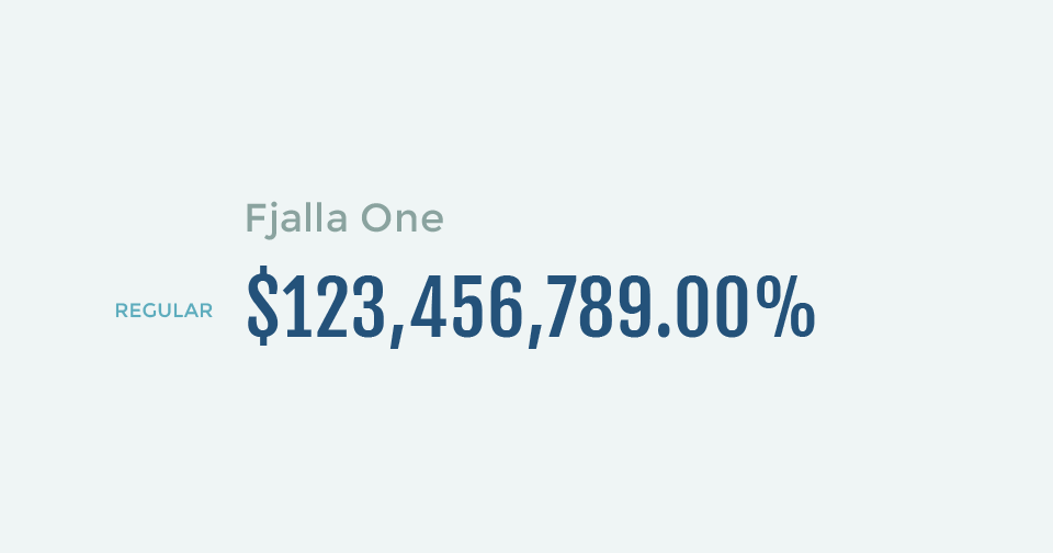
We struggled a lot with whether we should include Oswald because many use it as the condensed bolded number font, and maybe a free alternative of FF Din. However, Oswald’s dollar sign and number “4” looks inconsistent at times. Therefore we feature Fjalla One as a close alternative here with better balanced numbers.
More Resources and Discussions
There you have it! Our three principles in picking the best fonts for numbers and data visualizations, and 20 great free Google Fonts to display numbers.
I hope you find this article useful. If you want to get an email every time I write something new, subscribe to the list below.