Redesign Mobile Experience for Vertical Search Engines
Graphiq had 22 vertical search engines covering a wide range of topics—from electronics to pets, schools, software, and more. That was how Graphiq started as a company. We use a centralized template to generate pages for all those verticals and make regular updates to this system.
In 2014, we decided to redesign the mobile screens for our vertical search engines to improve the user engagement metrics and roll out our new card design language.
Background
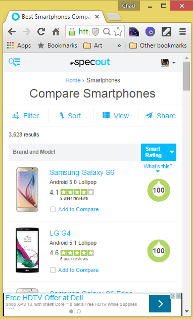
Graphiq started out in 2009 when people were struggling to make their websites responsive, and the mobile-first design concept was yet to exist. We completed quite a few mobile improvement sprints, but the poor mobile experience was still a legacy we bear.
The mobile page design before this sprint:

- 30% less time on site
- 40% less time on page
- 40% fewer pageviews per session
- 50% less likely to click on a listing
- 40% less likely to compare
- 50% less likely to filter
- Increasing filter rate, click through rate, and time on page on mobile
- Improve the overall design and aesthetics of the page on mobile
Designs and Prototypes
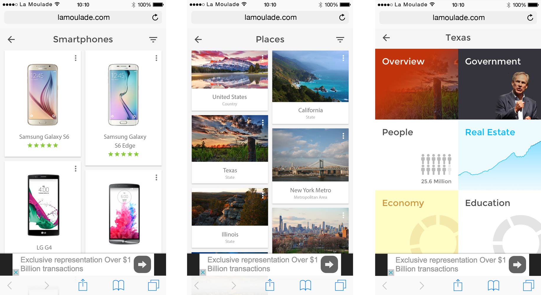
With the new design, we wanted to simplify the interface, adopt card design, and focus only on two core interactions: filtering and clicking through to see the details.
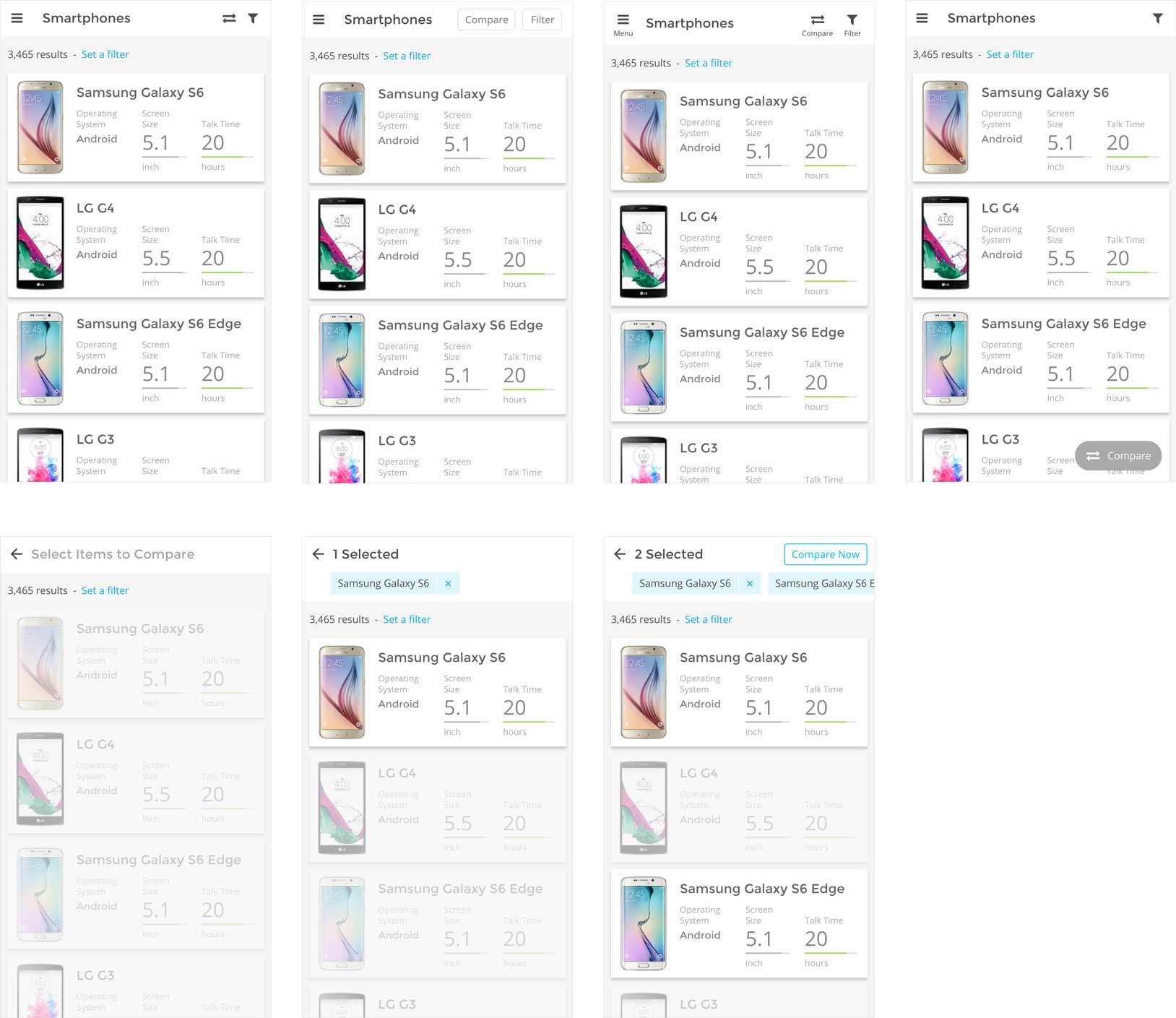
Here are a few mocks created before we implement the new design:
 |
 |
A/B Testing
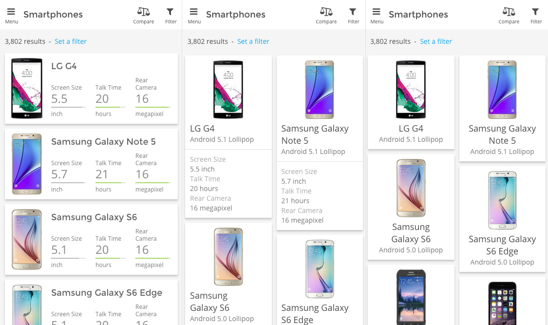
Discussed within the team, we consolidated all the designs into three variations:
 |
- A/B test the first one of the three new versions against the old version and see if it improved the metrics.
- When we saw positive impacts, we then tested amongst the three variations.
Test Result
- 32% improvement in users filtering
- 25% improvement in users clicking to a listing page
- 22% improvement in time on page
Others Tests
Testing is a core part of Graphiq design. We kept a brief record of all the tests we ran on a Tumblr blog before we got acquired. It’s not as organized as it’s mainly a internal knowledge-sharing platform, but if you are interested in our day-to-day user tests, check it out.
I hope you find this article useful. If you want to get an email every time I write something new, subscribe to the list below.