Graphiq Videos
Videos are a great format to walk the audience through not one but a handful of data visualizations and to tell a story, a deep insight we draw from our vast database. While Graphiq has a lot of experience building and scaling web products, it doesn’t have any experience building videos.
I designed and coded an HTML + CSS framework and a handful of templates to create webpages that look like 16:9 videos. And Alex Wilson, a ninja front-end developer, made a JavaScript library to play through those webpages like videos, used SlimerJS to take a screenshot of each frame, and then stitched them into mp4 files.
We started this project during Graphiq’s first Hackathon in 2015. It was introduced to the public on May 13, 2016, and now is in the growing phase. We had a lot of fun along the way.
Goals
There were two goals I wanted to achieve when I started making the framework for Graphiq videos:
- The HTML structure of each slide needs to be style-agnostic, so we can control the styles and layout just by applying different CSS classes to the wrapper. This will make it easy for us to update video templates in the future without changing any structural code.
- The video should be very responsive—every element should scale with the viewpoint and fill up the screen. This will ensure that generated video looks exactly the same as the live webpage preview.
Style-agnostic Structure
Like every popular video-making application, we organize our videos as a list of slides (or clips), conceptually like this in code — All the code snippets in this article are simplified for demo purpose. They are not actual samples of code we use in the production environment.
<div class="slides">
	<div class="slide"></div>
	...
</div>
Within each slide, I decided to make the HTML structure identical, just a list of the elements the slide contains:
<div class="slide">
	<div class="slide-title">Title</div>
	<div class="slide-text">Lorem ipsum dolor sit amet</div>
	<div class="slide-media"></div>
</div>
No structure, no nesting, just elements; everything else relies on the classes and styles.
Layout Basis
Position Absolute
From webpage to video, one big change in design and front-end code is the page is no longer a scrolling flow but a defined 16:9 screen.
This means not only new challenges since most CSS layout techniques do not apply, but also more freedom—everything can be position: absolute; with a defined place. This structure also eliminated the need for having structural HTML code in the slides.
So I decided to do exactly that, have .slide fill up the entire page with a fixed position, and every element within be set to position absolute.
.slide {
	position: fixed;
	top: 0;
	right: 0;
	bottom: 0;
	left: 0;
}
.slide-title,
.slide-text,
.slide-media {
	position: absolute;
}
vw and vh
With absolute positioning, how to place the elements in the correct space becomes the next question.
We need the slide to scale with the viewpoint so we can’t use absolute units like pixels. Among relative units, it’s either % or vw and vh.
We picked vw and vh because they are more predictable. Also, we could use vh within width calculation and vw in height. % leads to much more complicated calculations.
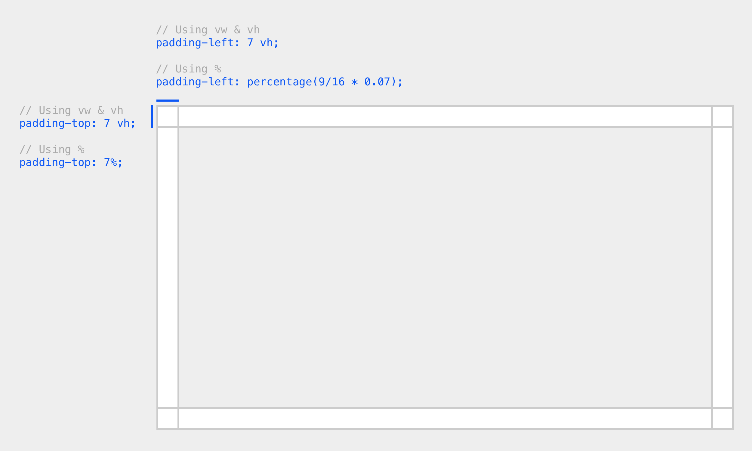 |
In addition, we wanted the text to size with the slide as well. The % in font-size attribute would be processed as a percentage of the inherited font size, not the parent <div> height, where vw and vh are still based on the viewpoint size.
That’s why we wrote the slide layouts in vw and vh units moving forward.
Layouts
Guidelines
Before jumping to create different classes for different layouts, I brainstormed about possible templates and came up with a set of simple guidelines:
Classes for Each Element
I then created all possible styles for every element that could be put into a slide. Take slide title as an example:
.slide-title {
	// Font size
	&.small {
		font-size: $titleFontSizeSm;
		line-height: $titleFontLineHeightSm;
	}
	&.normal { ... }
	&.large { ... }
	// Position
	&.position-top { top: $padding; }
	&.position-bottom { bottom: $padding; }
	&.position-middle {
		top: 50%;
		transform: translate(0, -50%);
	}
	&.position-center { ... }
	&.position-left { ... }
	&.position-right { ... }
	// Alignment
	&.align-right { text-align: right; }
	&.align-center { text-align: center; }
	// and many more ...
}
Layout Templates
After that, each layout template becomes just a combination of element classes. With SASS’s @extend feature, it’s very easy to write:
.slide.template-1 {
	.slide-title {
		@extend .slide-title.large;
		@extend .slide-title.position-middle;
		@extend .slide-title.align-right;
	}
	.slide-media {
		@extend .slide-media.mask-50;
	}
}
Some of the templates we have:
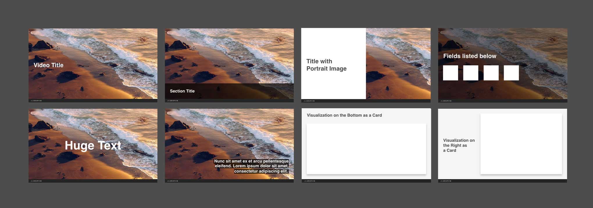 |
Later, we moved the video template to a JavaScript file, but the concept remained the same.
Themes
In addition to layout, we also wanted to use classes to give slides different themes.
Again, the themes had to be flexible. So we defined everything that should be controlled by the theme as a SASS object.
$theme-dark: (
	color-bg:    $bodyBlack,
	color-prime: $white,
);
We created a SASS mixin to generate style overrides for slides with theme classes.
@mixin theme($selector, $theme) {
	#{$selector} {
		background: map-get($theme, color-bg);
		.slide-title {
			color: map-get($theme, color-prime);
		}
	}
}
Then, we can call the mixin to generate style overrides for themed slides.
@include theme('.slide.theme-dark', $theme-dark);Slide Playground
A quick demo to show how easy it is to switch layouts and themes. It is also avaliable on CodePen.
More Examples
Apple Watch 2 Launch
Put news article in context with data.
Northwestern University Overview
Generated by a video template for hundreds of colleges.
Project Extension: Video Editor
After making this video technology, Wilson and I also created a web-based video editor so our knowledge engineers can organize Graphiq content into engaging and scalable videos.
I hope you find this article useful. If you want to get an email every time I write something new, subscribe to the list below.