What’s More to Design in a Chair
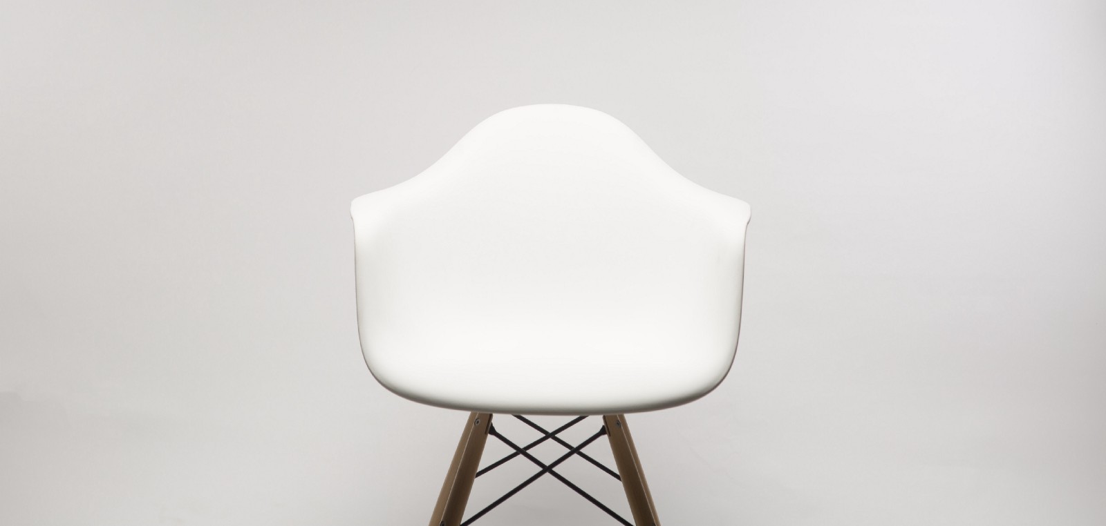 Photo by Dillon Mangum on Unsplash
OpenAI’s launch of GPT-3 was a wake-up call: AIs are evolving quickly, and the stories about AI surpassing human intelligence like a bullet train seem not-so-fictional these days.
Tobias van Schneider wrote in his recent article “UX designers automated by AI? When will it happen?”:
“The majority of work that is put out these days is mediocre at best…The majority of apps you see these days work pretty much like any other app…Both UX and UI designers have been working hard to standardize not only patterns and systems, but also libraries and guidelines. In a way, we’ve been automating ourselves out of our jobs for the last couple years already.”
Being a system-thinker designing for the past 6 years, I’m definitely in the same boat — I focus on creating design primitives that others can leverage and use like LEGO bricks.
On the one hand, it allows me to do the work that I find more interesting, thinking through how different types of data should be presented rather than spending lots of time on each individual dataset. At the same time, more and more of the field seems to have matured over the years, and there are times that I feel there’s not much more to design.
It’s daunting, but through a different lens, it’s actually a great collective win that we achieved as designers.
When human beings first got introduced to this world of machines, it was like entering Westworld. Engineers started to create file systems, applications, and functions before there was even a graphical interface, and when we finally got that interface, there were mountains of new ideas to visualize in a way that a broader audience understands — how do you present the idea of a file system that is not made of paper and ink but electrons? How do you convey to the user which elements on the screen they can interact with and how should they do that?
Over time, with many skillful designers, we’ve established the Human Interface Guidelines — the commonality of clicks, buttons, and even the icon with three horizontal lines now apparently means “menu” to everyone.

When we live in a world like this, trying to challenge the established, educated user pattern is counter-productive. Remember how many times we’ve tried to replace the very anti-ergonomic QWERTY keyboard layout but failed?
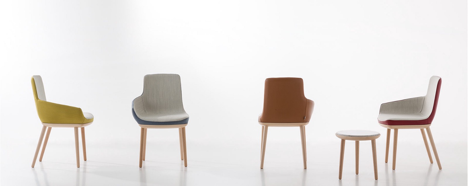
So instead, it’s indeed the design work that needs to be changed. Think about chairs — Every chair looks pretty much like any other chair, in same way that every app looks pretty much like any other app. But there are still many people who design chairs, and there are many brilliant chair designs.
 Source: https://www.alegredesign.es/works/ego-byv-chair/
While there are designs that challenge the definition of chair, sometimes it’s also about admitting what a chair is and moving on. The human body looks like this and likely will not change in another thousand years, so the chair has to be about knee height, with a flat surface and support for body weight. Good chairs have back support because we are lazy and want to lean back.
Similarly, a digital button should have a large enough area to be a point-target (for a cursor or finger) and should have a label or symbol to state its purpose (good buttons often have both).

Everything else, you get to design — the color, the font choice, solid vs. hollow, etc. But the core pattern is established.
It turns out there are many established product concepts in the world: chairs, doors, water bottles, hammers, cars, houses, the list goes on and on. Much of the design derives from the design of the human body itself: our hands are designed this way, so all our tools have to conform to that. In the same vein, the design of our mouth, eyes, and body all determine how products should work for us.
Those product concepts are so classic and eternal that they remind me of what philosophers like Plato would call “archetypes” — the ideas that seems to exist prior to any human experience.
The design of those concepts may feel more like discovered than invented. It’s designers’ share of uncovering the truth of the world.
 Photo by Orsolya Vékony on Unsplash
However, when we entered this digital era, we started to lose the constraints and the guidance that both came from our physical being.
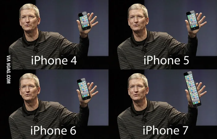
The interface hardware still follows some constraints. A mouse is designed to fit the palm, and although phone makers constantly push for larger screens, there is a limit.
 Source: https://9gag.com/gag/5349639
But you already start to see the constraints loosening. Take the keyboard, for example. The general design is based on the size and shape of the hand, but the location of each key is arbitrary. That allows the QWERTY vs. Dvorak conversation to happen in the first place.
When we get to entire software interfaces, it’s a free-for-all. I dream about the early days in the Human-Computer Interaction field, the time before “windows” (not the company but the UI element), “status bars” and “docks” were introduced. It was a blank canvas.

There were definitely principles and measuring sticks for good vs. bad design: the reference of real-world objects, the resemblance of how the underlying system works, etc. But I don’t believe we would have the same design for docks and windows or even the concepts of them in a parallel universe; while as long as human beings look the same, I’m pretty sure we will all have very similar chairs and bowls.
We lived in a rare era during the digital revolution, where we had a blank canvas laid out in front of us and lots of interaction models were yet to be defined.
Now that everything in the digital world is maturing, we’ve started to have new constraints in our designs. Not in the form of physical limitations, but in the form of education costs. Surely, we can come up with a better design for the menu button, and no one likes the hamburger, but is that still worth it at this point?
As the educational cost and familiarity build moats for existing design patterns, an app design may look increasingly like a chair design. There is still a need for chair designers, but they might be a different type of designers than the current UX designers for digital products.
There’s a reason why we are seeing more stylistic trends in the UX design world, like the pendulum swing between skeuomorphism and minimalism in Apple’s design language.
 Source: https://uxdesign.cc/no-apple-is-not-moving-towards-neumorphism-3c144d74c53b
UX design as we know it might become a thing of past, and it may look like industrial design or fashion design in the future. There will still be places for human taste and judgement to shine — and that’s the kind of value that AI would struggle to replace. But if you are into UX design in its current form, I can only see a few blue oceans in the HCI field.
Mixed reality seems to be one of them, but even mixed reality incorporates ideas like pointers from the existing digital design to save on education cost. And some VR designs are literally spaces of floating panels.
How humans interact with AI is maybe the next true blank canvas. Elon Musk’s other investment, Neuralink, might open the door to a new world. However, I can’t even begin to wrap my mind around what a brain-computer interface would be like. I guess it’s the same way a chair designer would feel at the dawn of the computer age.
I hope you find this article useful. If you want to get an email every time I write something new, subscribe to the list below.