Measuring Customer Satisfaction
It was a challenge to measure the quality of multimodal experiences that we deliver on Alexa devices. Not every user are staring at the screen when they ask a question on a screen device. The device could be sitting in the corner across the room. Until the recent launch of Visual ID, we have little data there. Also, many visual responses don’t provide touch interactions, so we can’t infer what customers want from their “click through rate”.
Human Annotation
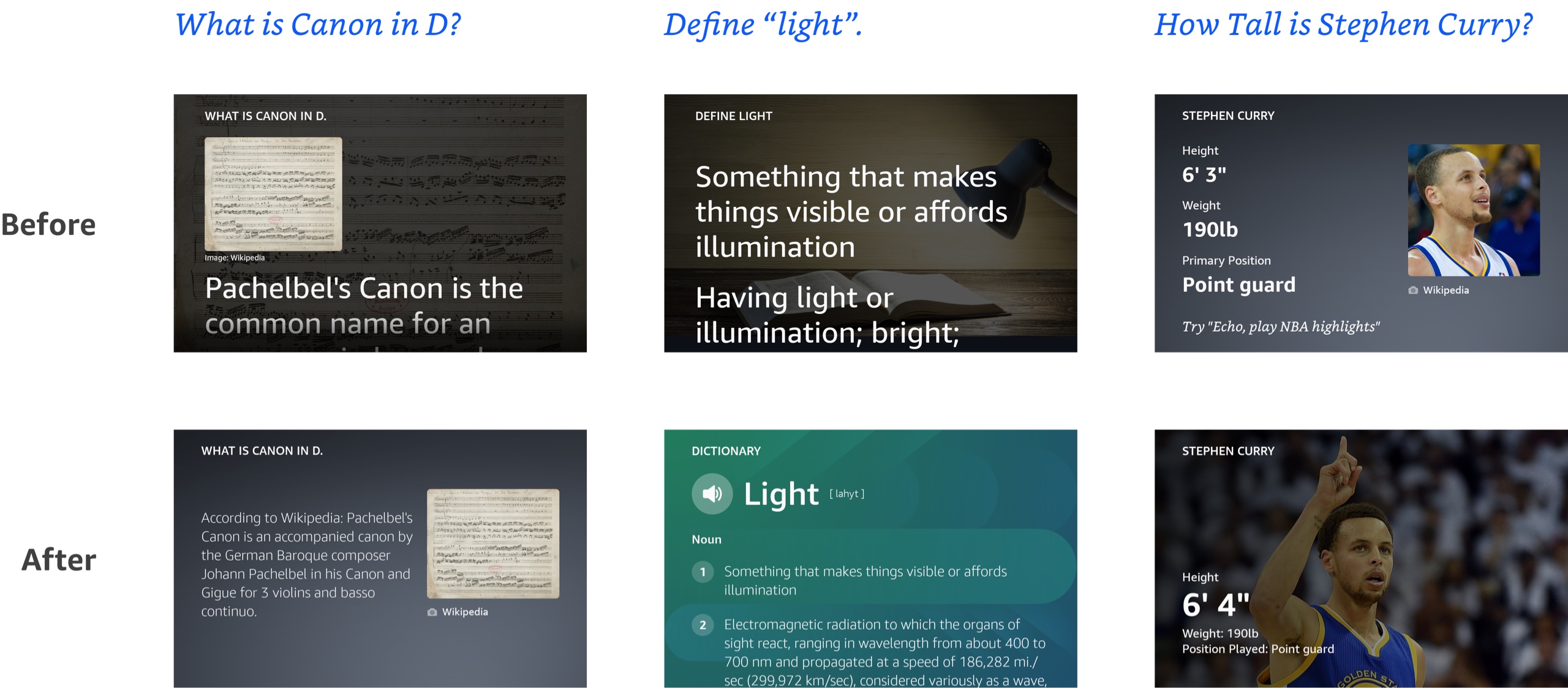
The first solution the team tried to adopt is human annotation. We write a comprehensive guidelines to outline what a good multimodal experience should be, and then we train annotators to grade experiences according to the rubrics. We do it for voice answers, and it has been working for Alexa Knowledge.
There is only one issue: We don’t really know what a good multimodal experience should be.
Voice answer has way fewer variables — if an answer is grammatically and factually correct, has the right length and the right order, and contains all the necessary metadata, it’s pretty much there.
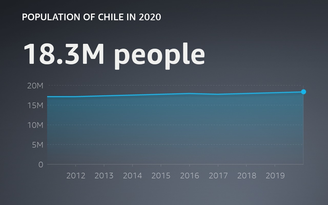
Visual answer doesn’t have such consensus — when people ask “How many people live in Chile?” is it more helpful to show a line graph of the population growth, or is it more helpful to show other relevant attributes for Chile, with a beautiful image? Or both?
 |
 |
Similarly, when people ask “Who is Hugh Jackman?” do they want to just see a beautiful fullscreen image, or do they also value seeing the answer text on the screen?

|
There is no clear answer. Because of that, getting into human annotation guidelines prematurely would only re-enforce our own convictions and biases. It might not help us to actually improve the quality of experiences for our customers.
User Survey
To help connect the team with the customers and derive multimodal guidelines from user feedback, I worked with UX researchers to design a study where we record hundreds of experiences as-is and send them to thousands of voice assistant users for their rating and reasoning behind.
|
Who won between Tennessee and Alabama? |
Can dogs eat blackberries? |
From there, we then aggregate the scores and use regression model to find which features of the multimodal answer — does it contain an image, does it use a custom layout, etc. contributes the most to customers’ rating. We also use it to identify the flaws in experience designs and make data driven improvements.
 |
We launched the study in the United States, Germany, and Japan. Every time, it lead us to new insights and allow us to continue to dive deeper. Based on those findings, we then wrote the design guidelines for Alexa Knowledge experiences.
Visual Component for Feedback
While user survey gave us a lot of good information and it’s especially good at answering why certain experience has a higher rating than others, it’s quite resource consuming to capture experiences and run the study.
To collect user feedback faster and on a broader scale, we also launched a new visual component that would allow us to target a small percentage of users across the board and get realtime data right before I leave Amazon.

Hopefully it would provide more timely feedback to the team and help us correlate visual quality to other business metrics like engagement and downstream impact.
I hope you find this article useful. If you want to get an email every time I write something new, subscribe to the list below.